Chapter 7. Initials and other illuminations
Version 3.0 (12 December 2019)
by Friederike Richter and Beeke Stegmann
7.1 How and where to encode illuminations
Medieval manuscripts often contain some degree of illumination as e.g. marginal drawings or initials. Encoding and systematic recording of the occurring illuminations enables the XML data to become a highly useful tool for scholars working from many different angles. For instance, studies in material philology and art history will highly benefit from it, because it enables scholars to search for and, thus, easily find relevant instances. What is more, the careful encoding of initials and their decoration will provide deeper insight into the indented hierarchy, structure and layout of manuscripts. In fact, one of the major advantages of including descriptions of these visual elements into digital transcriptions is the direct linking to the manuscript’s text.
In a menotic XML-file, we recommend that information on the illuminations (incl. the initials) is distributed and encoded in two designated places:
1. in the header as part of the manuscript description (see 7.2 below) and
2. in the body as part of the transcription (see 7.3 below).
While the manuscript description in the header should include a register of all illuminations including the initials (see also ch. 14.3.3), in the transcription only initials are encoded, as they are part of the wording of the text. The register of illuminations in the header is mainly a description in prose and can even be rather elaborate (if desired and appropriate). By contrast, the encoding in the transcription is more basic and covers only a few central characteristics that are specified by means of attributes, which makes them highly searchable.
The following overview summarizes what to encode where and links to the respective subchapters of these guidelines:
| Where | What |
|---|---|
| In the manuscript description (<teiHeader>) |
All illuminations (including initials) of the manuscript are listed
chronologically, giving information on: - Type and occurrence of illumination (for initials ch. 7.2.1.1, for other illuminations ch. 7.2.2.1). - Description of the motif or decoration (for initials ch. 7.2.1.2, for other illuminations ch. 7.2.2.2; for optional further details see ch. 7.2.6 on illumination techniques and ch. 7.2.7 on motifs and composition). - Inks and colours used (ch. 7.2.3). - Captions (ch. 7.2.4). - Hands and dating (ch. 7.2.5). |
| In the transcription (<body>) |
Basic characteristics of initials are encoded where they occur in the
text, giving information on: - The letter and its form (ch. 7.3.1). - Hierarchy of initials (ch. 7.3.2). - Initial size (ch. 7.3.3). - Colours used (ch. 7.3.4). - Artistic rendition (ch. 7.3.5). |
Note also the glossary in the end of the chapter that helps, among others, to identify and name the different parts of an initial (see 7.4). Furthermore, we refer to the introduction to manuscript illumination by Michelle Brown (1994), which is available in an updated version in the Glossaries of the British Library, as well as to Christine Jakobi-Mirwald (2008). Both works were used to prepare this chapter, while some definitions were adapted for the corpus of Scandinavian manuscripts.
7.2 Listing all illuminations in the header
As a minimum standard, we recommend to register all instances of illumination, including initials, as part of the manuscript description in the header. This section describes how to register illuminations in a consecutive list covering the main informations
All illuminations should be listed within the element <decoDesc> in the manuscript description section of the header (see also ch. 14.3.3). A separate <decoNote> is used for each illumination – including the major initials. The register should be chronological, i.e. following the order of occurrence in the manuscript.
A basic list registering the illuminations within the header could look like this:
<decoDesc>
  <decoNote>
    <p>F. <locus from="1r" to="1r">1r</locus>:
      Full-page illumination, Christ on the cross.
      Colours: yellow, blue, light red.
      Outline: black.</p>
  </decoNote>

   <decoNote>
     <p>F. <locus from="1va" to="1va">1va</locus>:
       Historiated opening initial M depicting king Magnús, 12 l.
       Colours: light red, blue, green, yellow.
       Outline: black.</p>
   </decoNote>

  <decoNote>
    <p>Ff. <locus from="1v" to="98v">1v-98v</locus>:
      foliate chapter initials, 2–3 l.
      Colours: alternating red, blue with black foliage.</p>
  </decoNote>
</decoDesc>
Each <decoNote>-entry starts with the indication of the folio (and if applicable the column) of the respective illumination, which is encoded in a <locus> element. Second, each <decoNote> should indicate the illumination type in question, e.g. full-page illumination or opening initial. These would then be supplemented with brief information on motif/ornament and colours. However, the degree of detail that can be given in the description of illuminations is virtually unlimited. For non-specialists we recommend to aim for a basic description that should not take too much time, but still gives someone who does not have access to the manuscript or images thereof a good overview as to how many and what kind of illuminations the manuscript contains.
In the specifications below, initials will be discussed separately from other illumination types (see ch. 7.2.1 for initials and ch. 7.2.2 for other illuminations), because they partly require different terms and procedures in the respective entries. Please note, that the listing of illuminations in the header does not separate the major initials from other illuminations, but registers all instances consistently in the order of their occurrences in the manuscript. The occurrence of minor initials, on the other hand, can be summarized at the end (as in the example above). Common categories, that apply to both various initials and other illuminations may be treated subsequently (i.a. colours, captions, hands and dating).
7.2.1 Initials
Initials are according to their hierarchy distinguished into two categories in the manuscript which are treated differently: major and minor intials (see below). It is good practice to register all major initials in the same way as other illuminations in the chronological order as they appear in the manuscript (i.e. in a separate <decoNote> element). Minor initials may be summarized at the end of the list in a common <decoNote> element for each subtype. Each entry for an intial should, as a minimum, comprise information on the following: a) Folio/column, b) Decoration and hierarchy, c) Letter, size and colour(s).
7.2.1.1 Major and minor initials
The occurrence of the different subtypes of the initials has to be assessed for every manuscript individually. Manuscripts often comprise different initial subtypes that can be distinguished both by their hierarchy in relation to the structure of the text as well as by their size and degree of decoration. When, however, the traditional chapter division of a text or other structural interpretations common in printed editions do not match the hierarchy indicated in the manuscript by means of size and decoration of the initials, the subtypes are treated according to the manuscript’s own hierarchy.
The possible subtypes for initials are: opening initial, text initial, chapter initial, paragraph initial and sentence initial (littera notabilior). It is, however, also legitimate to only distinguish between major and minor initials. Most manuscripts do not comprise all subtypes; their occurrence can depend on the genre, the number of the works included in the manuscript, and the general degree of illumination. One has, thus, to identify which levels are present in the manuscript and meaningful to be distinguished (see also 7.3.2 Hierarchy of initials).
Put simply, as major initials we consider rather large and elaborate initials. They are usually opening, text or – depending on the manuscript’s structure – chapter initials. These initials will typically not appear on every page, but rather divide the written text into major sections. For each of these major initials, the letter is named, its folio (and if applicable the column) is given, the kind of initial is indicated as well as its height (i.e. number of indented lines):
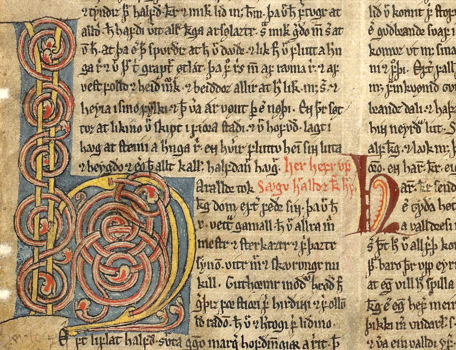
Ill. 7.1. AM 45 fol., f. 8va, l. 19–36, foliate text initial “h”. In column b next to it is an example of a chapter initial in this manuscript.
<decoNote>
  <p>F. <locus from="8va" to="8va">8va</locus>:
    foliate text initial h, 8 l.
    Colours: light yellow, red, light blue.</p>
</decoNote>
As minor initials we consider less elaborate, but highly frequent initials, that will typically appear more than once on a single page. Depending on the manuscript’s structure these can be paragraph and sentence initials (i.e. littera notabilior), but in some cases also chapter intials. All occurrences of minor initials may be treated in groups, using one <decoNote> element for each subtype. Such summary entries are usually placed at the end of the list of initials, simply indicating the first and the last folio of their respective occurrence and summarizing the average height (i.e. number of indented or covered lines), skipping the indication of the respective letters:
<decoDesc>
 ...
  <decoNote>
    <p>Ff. <locus from="1r" to="27v">1r–27v</locus>:
      colour-stroked paragraph initials, 2–3 l.
      Colours: Black with red highlighting.</p>
  </decoNote>
</decoDesc>
Please note that it is also of interest to register missing initials, i.e. those cases where an initial was laid out, but the allowed space was never filled. Sometimes, these instances contain guiding notes for the illuminator e.g. indicating the respective letter to be filled in (guide letter).
<decoDesc>
 ...
  <decoNote>
    <p>Ff. <locus from="2r" to="6v">2r, 3v, 5r–6v</locus>:
      Missing paragraph initials, 2-3 l.</p>
  </decoNote>
</decoDesc>
7.2.1.2 Initial forms and decoration
Initials occur in various shapes and decorations. The overview below lists characteristic initial forms and common modes of decoration that are desirable to identify with the correct terms. Please note that the forms and decoration often occur in combination and the encoder would in these cases indicate more than one form or decoration, e.g. a dragon initial that is foliate or a pen-flourished lombard. Certain forms and modes of decoration, however, are mutually exclusive, e.g. a versal cannot be inhabited.
| Example | Form and decoration | Explanation |
|---|---|---|
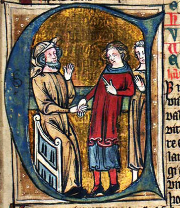
|
Historiated initial | The initial comprises identifiable representational motifs with an
illustrative function (i.e. referring to the content of the text). It
is desirable to identify the motif of a historiated initial. In the example: Historiated initial “E” showing the lease of land by handshake in Landsleigubálkr of King Magnús Lagabætir’s landslov in GKS 1154 fol., Hardenberg’s Codex, f. 35r, l. 18–32. |
|
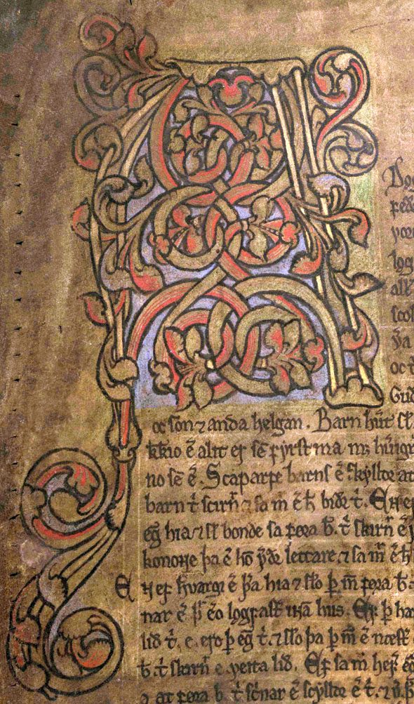
Foliate initial | The initial is decorated with botanical decoration as creeping branches
with leaves, buds and flowers or spiral vines. Foliage can elongate
the shafts of a letter into the margins in the form of termination.
In some cases, the termination can be so much elaborated that the foliation frames the page’s text.
In contrast to borders, however, the text area is not decreased by the foliation. In the example: Foliate initial “A” with spiral vines and curlicue in AM 334 fol., Staðarhólsbók, f. 1va, l. 1–9. |
|
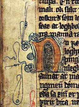
Pen-flourished initial | Fragile embellishment of both geometrical and foliate motifs executed as very fine hair-lines solely in
(coloured) ink. Placed in the counter of the letter it is called infilling;
when attached to the letter it is called external pen flourish,
which often ends with tendril extenders that extend widely into the
margins. In the example: Pen-flourished initial “n” with delicate tendrils executed with dark blue ink and pen. The body of the initial is decorated with gold leaf. Found in GKS 1154 fol., Hardenberg’s Codex, f. 5v, l. 20–23. |
|
Penwork initial | Initial solely drawn with a pen (not a brush) with a subdued degree
of decoration as loops and curlicues. Mostly found in early modern
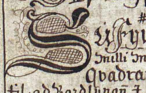
manuscripts using the same ink as the main text. In the example: Penwork initial “S”, as they often appear in early modern manuscripts, in Lbs 781 4to, f. 6v, l. 26–28. |
|
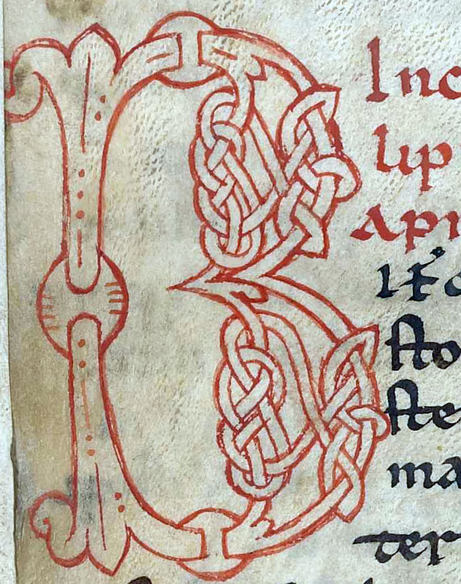
Interlaced initial | The body of the initial is formed by geometrically interwoven and
knotted ribbons. In the example: Interlaced initial “B” in AM 795 4to, f. 24v, l. 1–8. |
|
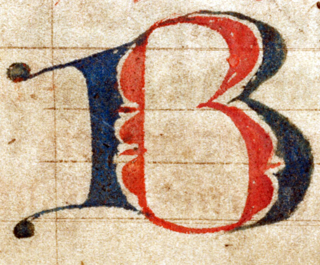
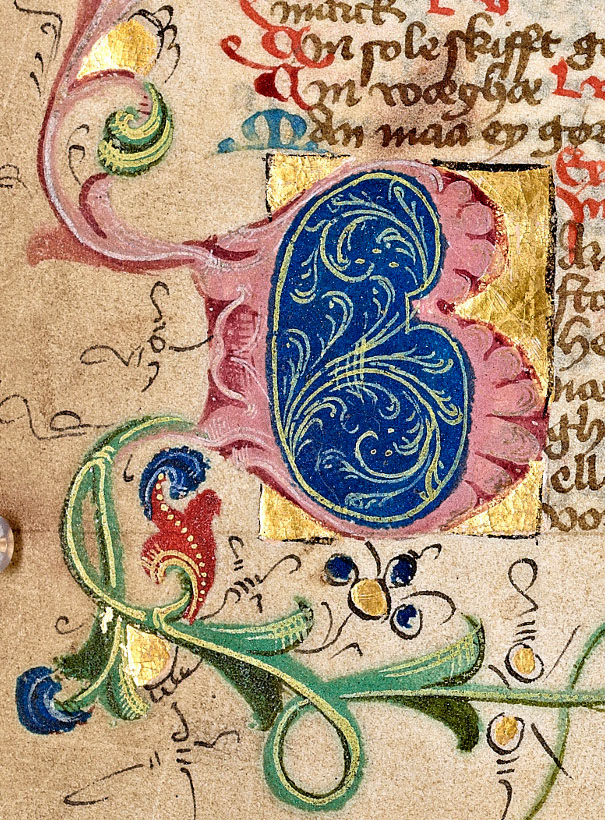
Puzzle initial | The body of the letter is excecuted in two (or more) contrasting
colours, leaving a thin white gap inbetween. In the example: Puzzle initial “B” in red and blue in Lund, Medeltidshandskrift 18, f. 6r, l. 13–16. The shape of the letter’s body is that of a lombard (see below). |
|
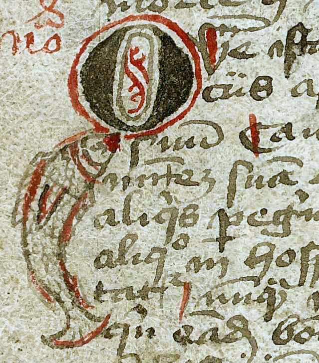
Zoomorphic initial | The body or part of the initial is formed by an animal. Please
indicate in the description which kind of animal it is (for dragons:
see dragon initial below). In the example: Zoomorphic initial “Q”, the cauda of the letter is in the shape of a fish in AM 76 8vo, f. 23v, l. 10–11. |
|
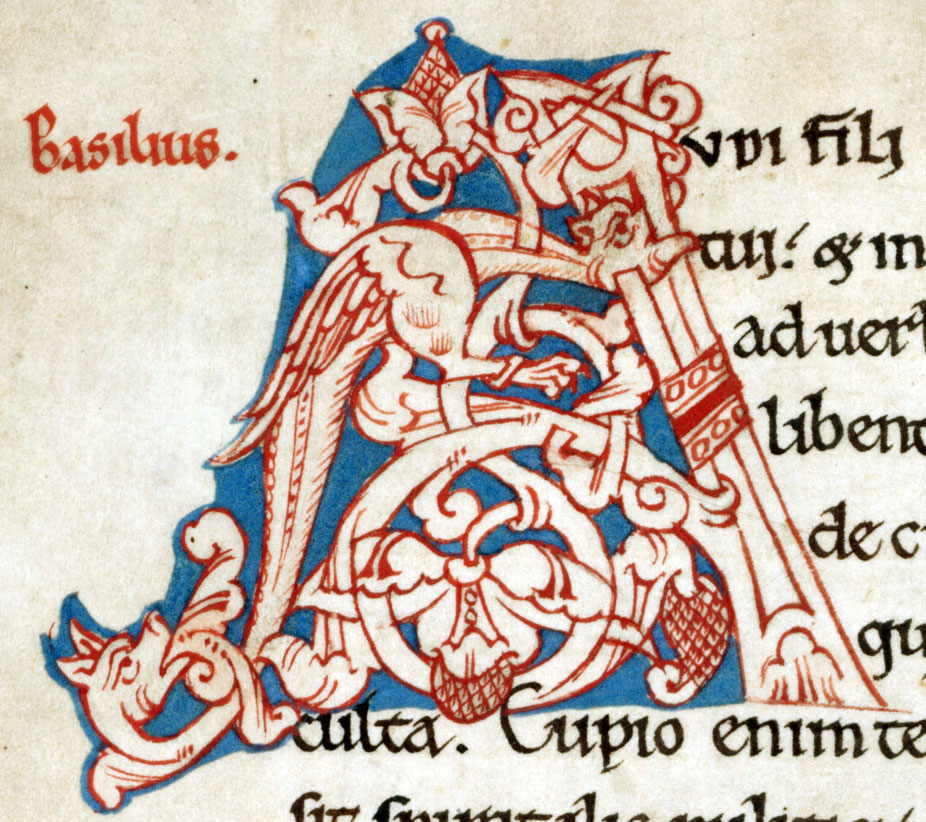
Dragon initial | The body of the letter or part of it is formed by a dragon. Dragons
usually have fanged jaws, feathered wings and two legs with claws. In the example: Two-headed dragon forming part of the body of the foliate initial “a” in Lund, Medeltidshandskrift 6, f. 6v, l. 1–6. |
|
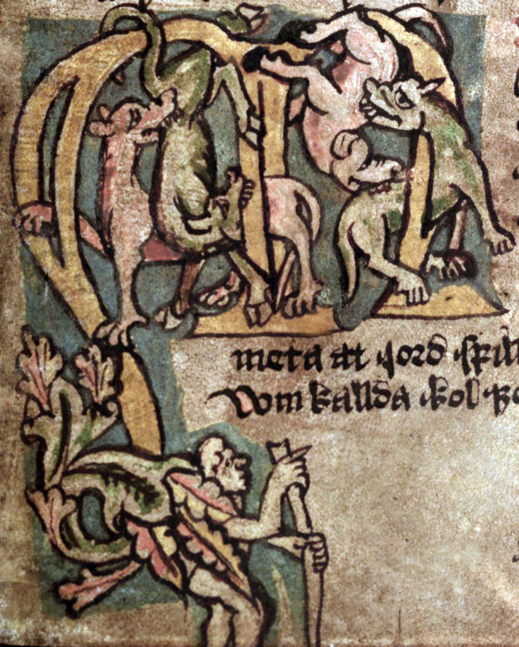
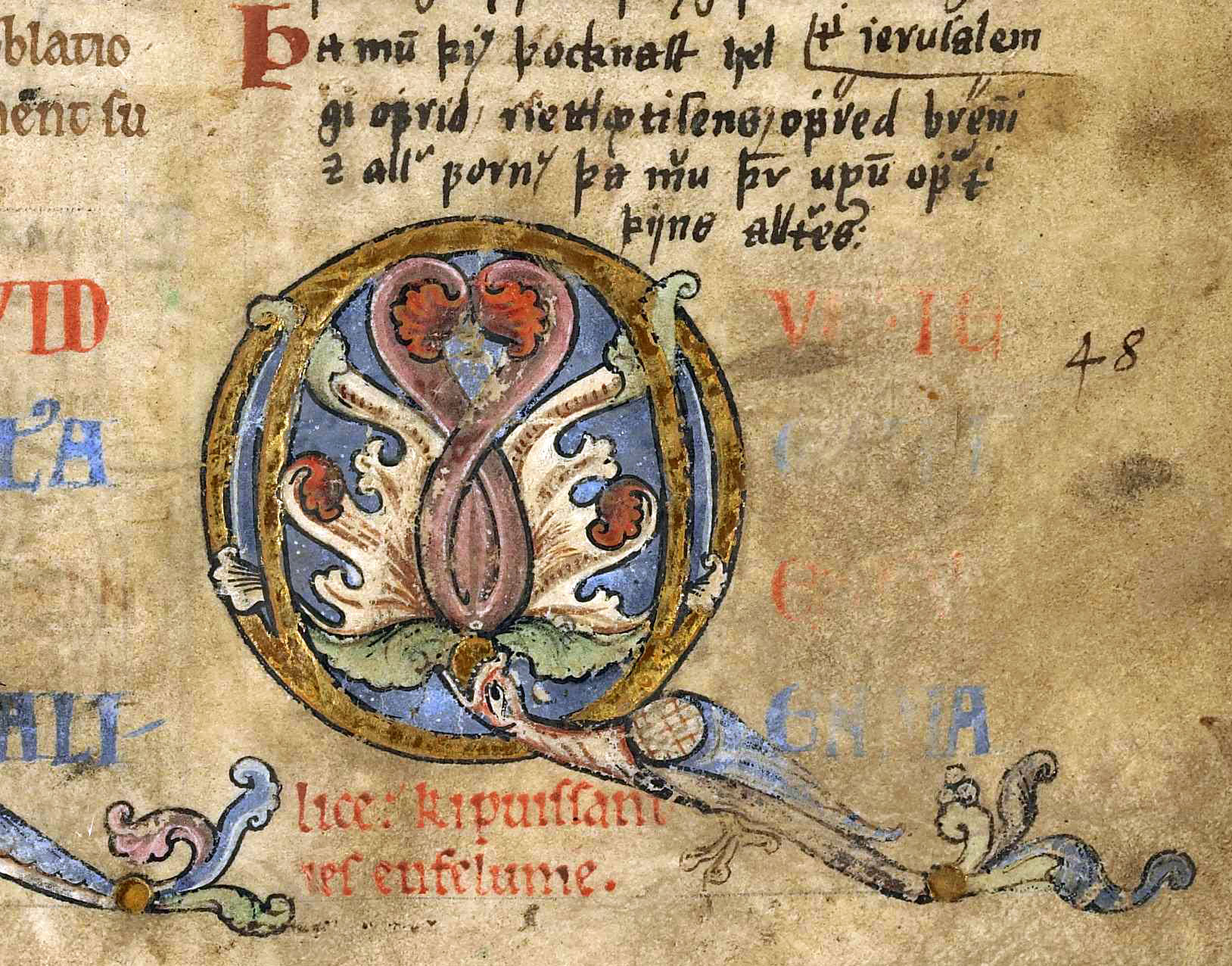
Inhabited initial | Human, animal or fantasy creatures are placed within the letter or its
foliage, often playfully climbing in it with a solely decorative function. It is
desirable to identify the kind of inhabiting creatures. Inhabited initials are
distinct from historiated initials by not illustrating or referring to the content
of the text (see also historiated initials above). In the example: By climbing canines inhabited initial “M” in AM 147 4to, Heynesbók, f. 89r, l. 16–22. |
|
Lombard | Enlarged letter in a rather bulgy and rounded shape. The body can be
plain-coloured or more elaborated and at times, further decoration such as pen flourish occurs. In the example: The lombard “E” in AM 65 4to, f. 4v, l. 17–18. |
|
Versal | The first letter of a line is clearly out-dented into the
left margin, frequently with no or only little decoration and using the
same ink as the text. Versals are usually used for minor initials and are often not
much higher than what corresponds to a single line of text.
Please note, however, that versals can occur on different levels of the
initial hierarchy. In the example: Sentence initials executed as versals at the beginning of every stanza of Hákonarmál in AM 45 fol., f. 18va, l. 31–38. |
|
Colour-stroked initial | Sentence initials that are highlighted by an additional stroke of ink, usually in red. In the example: Red colour-stroked sentence initials in NKS 2237 4to, f. 4v, l. 18–24. |
|
Incipit | The incipit of a text written in display script, i.e. enlarged, colored,
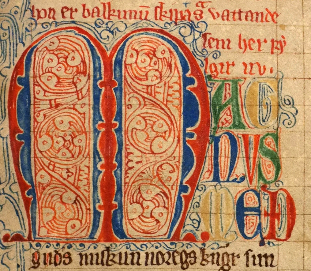
decorated or written in another script. In the example: Coloured (green, yellow, blue, red) and enlarged incipit “AGNVS MEД with red and blue pen flourish, following the pen-flourished puzzle linitial “M” (red, blue) in AM 56 4to, f. 1r, l. 8-10. |
|
Missing initial | The initial has been cut out or is omitted, i.e. space has been left for it
but it was never filled in. Sometimes small guide letters indicate the planned
letter to the illuminator (see also guide letter). In the example: The text initial “M” has been cut out, also removing the foliation extending in the outer and lower margin in AM 789 4to, f. 2v, l. 13-19. |
|
Guide letter | A small letter in the margin or the indented space for the initial indicating
to the illuminator which letter to draw. Guide letters are found both in combination
with executed initials and missing ones. In the example: The missing initial “Þ” that was planned, but never executed as is visible from the indented four lines of the text, and the guide letter “þ” in the margin in AM 557 4to, f. 3r, l. 26–30. |
| [Anything else] | All other instances: Name what you see (incl. representative motifs
and figural ornamentation). |
Table 1. Ill. 7.2–7.16 listing the most common initial forms and and modes of decoration.
The initial form and/or decoration are incorporated into the description of the illumination type:
<decoNote>
  <p>F. <locus from="3r" to="3r">3r:24-26</locus>:
    chapter initial M executed as pen-flourished lombard, 3 l.
    Colours: blue, light red.
  </p>
</decoNote>
A longer and somewhat more detailed description that would obscure the readability if provided in the beginning may be given later in the <decoNote> (see ch. 7.2.7).
7.2.2 Other illuminations
In the same way as for the major initials, each occurence of the other illumination types, for instance a miniature, is registered in a separate <decoNote> element in the header. A register entry of illuminations other than initials comprises as a minimum of the following: a) Folio/column, b) Type and motif/ornament, c) Caption (if applicable), d) Colours.
7.2.2.1 Illumination types
When registering illuminations in <decoNote>, the place where it occurs is given, followed by the identification of the illumination type. The different types are characterized by their position and size in relation to the written text. The following table gives an overview over the most frequent types of illuminations (other than initials) that we consider desirable to be identified.
| Example | Illumination type | Explanation |
|---|---|---|
|
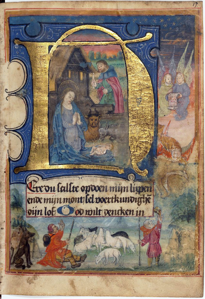
Full-page illumination | Illumination, often framed, covering the size of the
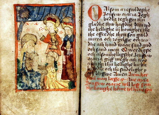
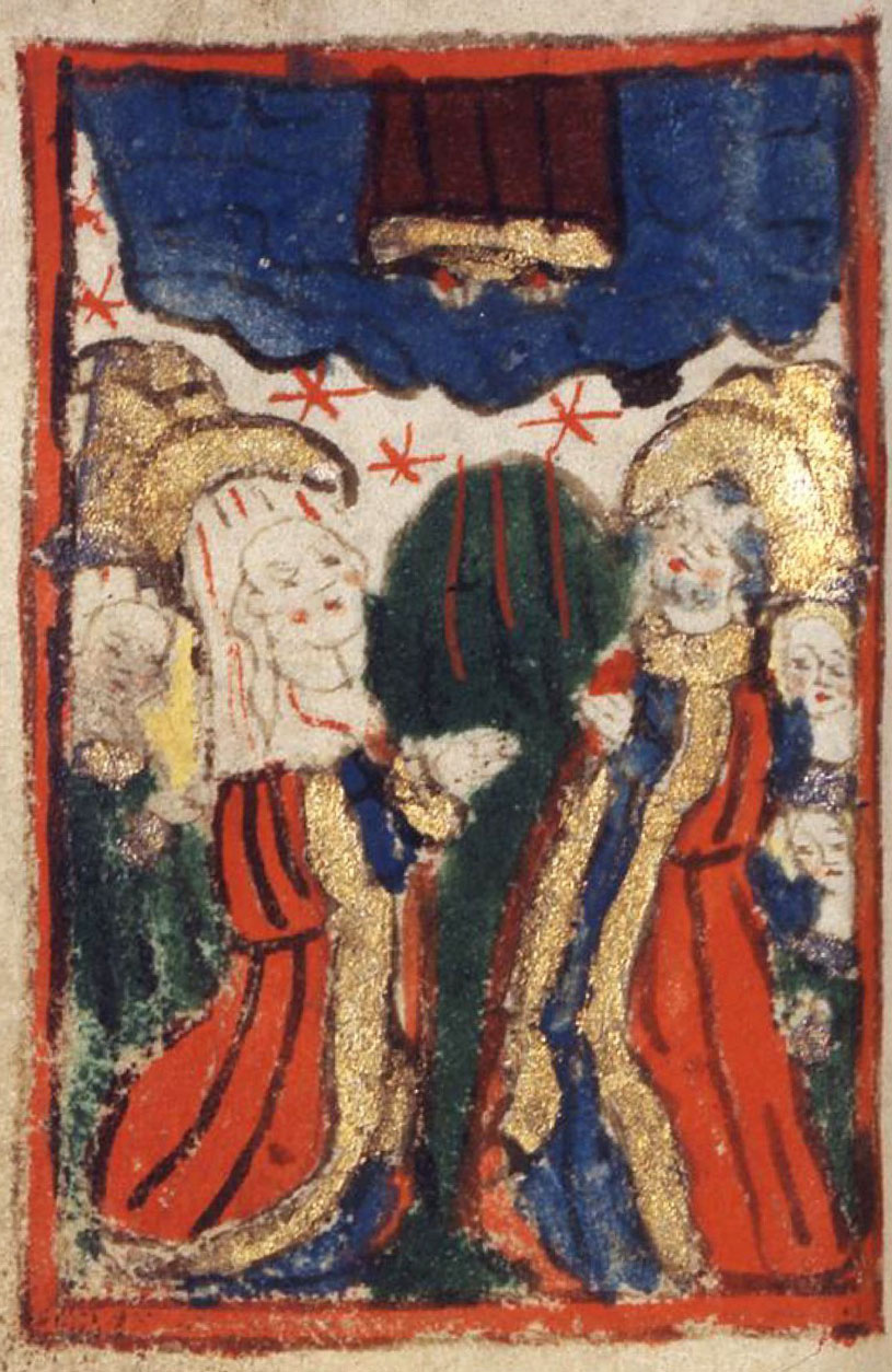
written area elsewhere in the manuscript. In the example: Full-page illumination depicting the adoration of the Magi in AM 421 12mo, Marine Jesperdatter’s prayer book, f. 47v–48r. |
|
Miniature | Illumination within the written area that is not connected to an
initial. A miniature is usually framed and its size corresponds
to the width of the column. The motif frequently illustrates a passage of the
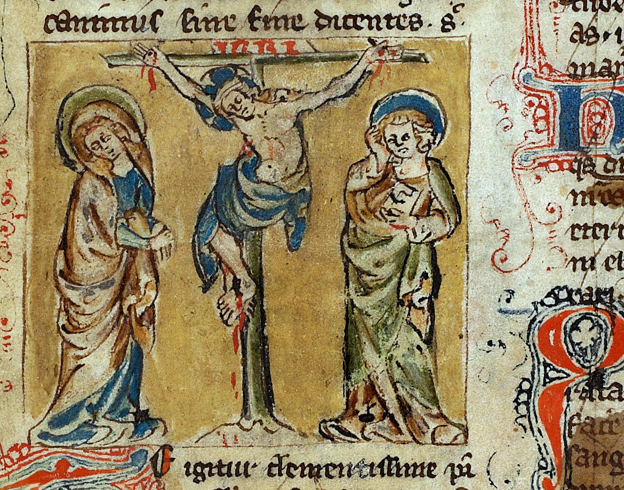
text. In the example: Framed miniature showing Christ on the cross with Mary and John on either side in AM 733 4to, f. 5va, in between l. 20–21. |
|
Marginal drawing | Drawings outside the written area, usually unframed and not connected to
any initial. The drawing can be placed in all four margins of a page,
but appear most frequently in the outer and lower margins. The motifs
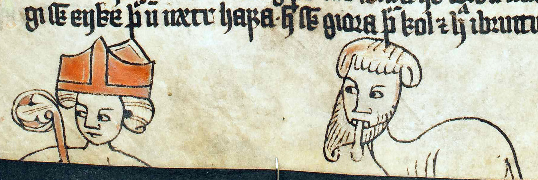
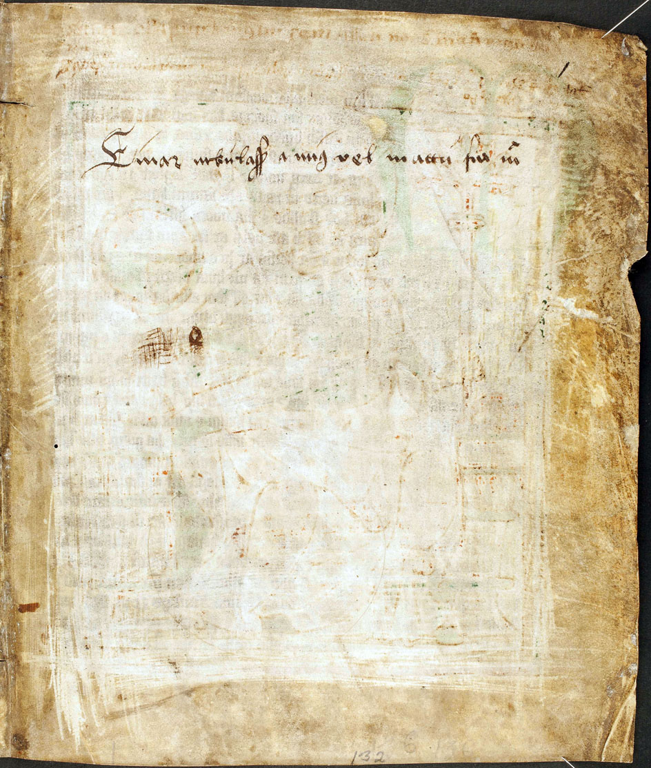
can refer to the written text but can also be of playful character. In the example: A marginal drawing showing a bishop and a bearded grotesque figure sticking out its tongue in AM 132 4to, f. 29v, bottom margin. |
|
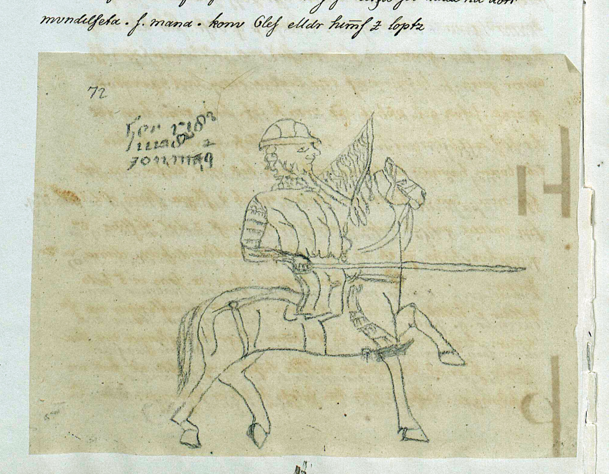
Bas-de-page | Elaborate drawing that usually covers most of the lower margins and that
is connected to a bar attached to an initial. The often playful
motifs (drollery) can refer to the written text or other illuminations
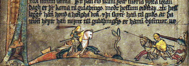
on the page. In the example: Bas-de-page with two jousting knights riding towards each other. The illumination is placed on a bar that is attached to the initial “F” in GKS 1154 fol., Hardenberg’s Codex, f. 2v, lower margin. |
|
Border | Outstanding illuminated margins that frame the incipit of a text
(or section), significantly reducing the written area of a page. They
usually co-occur with extraordinary enlarged and decorated initials
(cf. incipit page). Borders can either be ornamental (foliate, inhabited)
or historiated (with identifiable representative motifs). Rare in
manuscripts that were produced in Scandinavia. In the example: Historiated border in a Dutch prayer book with a historiated initial depicting scenes from the birth of Christ in AM 71 8vo, f. 17r. |
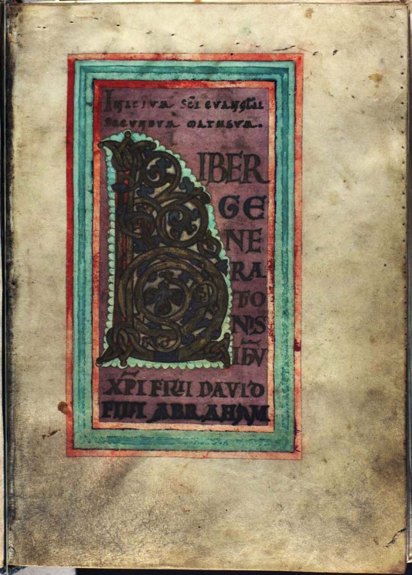
|
Incipit page | Decorated page highlighting the beginning of a text (or section) comprising
the incipit in enlarged display script and an extraordinary enlarged
initial. The background is usually coloured and framed. The focus is on
script and there are usually no ornaments or figurative motifs exceeding/beyond the
initial (cf. border). In the example: Framed incipit page opening Matthew’s gospel comprising a foliate initial and the incipit in display script on purple ground in Thott 21 4to, f. 5r. |
|
Display page | Unframed page with solely enlarged, decorated display script, often the incipit of a text (or section),
sometimes before or after a larger initial (cf. incipit page).
In the example: Unframed display page with colored display script opening Rekabálkr of Jónsbók, in GKS 3274 a 4to, f. 22v. |
|
Line fillers | More or less elaborate ornaments filling the unwritten whitespace of
written lines, typically the last part of the line: They can be simple
(coloured) lines, but sometimes they depict serpents, fish or other
animals. The occurrence of line fillers can be summarized at the end
of the list. In the example: Red and blue line fillers in AM 4 4to, f. 3r, l. 11–18. |
|
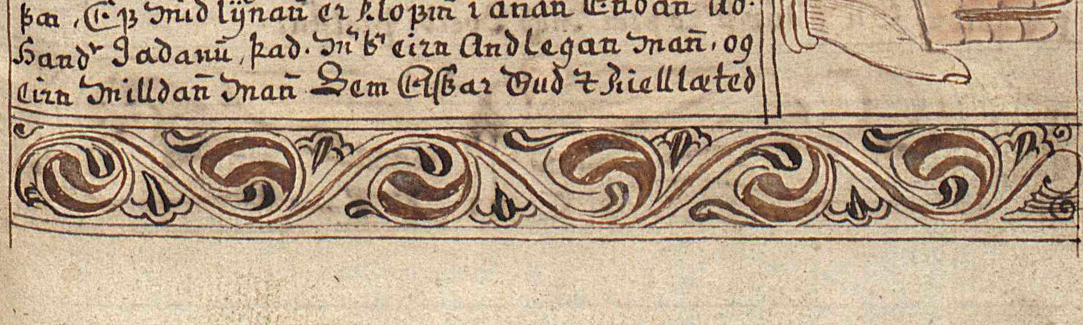
Frieze | Ornamental horizontal element above, within or below the text, usually
covering most of the width of the written area. In the example: Horizontal frieze drawn with ink placed below the script and illuminations in Lbs 781 4to, f. 17r. |
|
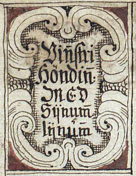
Cartouche | Frame comprising a short caption, usually emulating three-dimensional
organic forms. In the example: A cartouche comprising the caption of the illumination of a hand in Lbs 781 4to, f. 4v. |
|
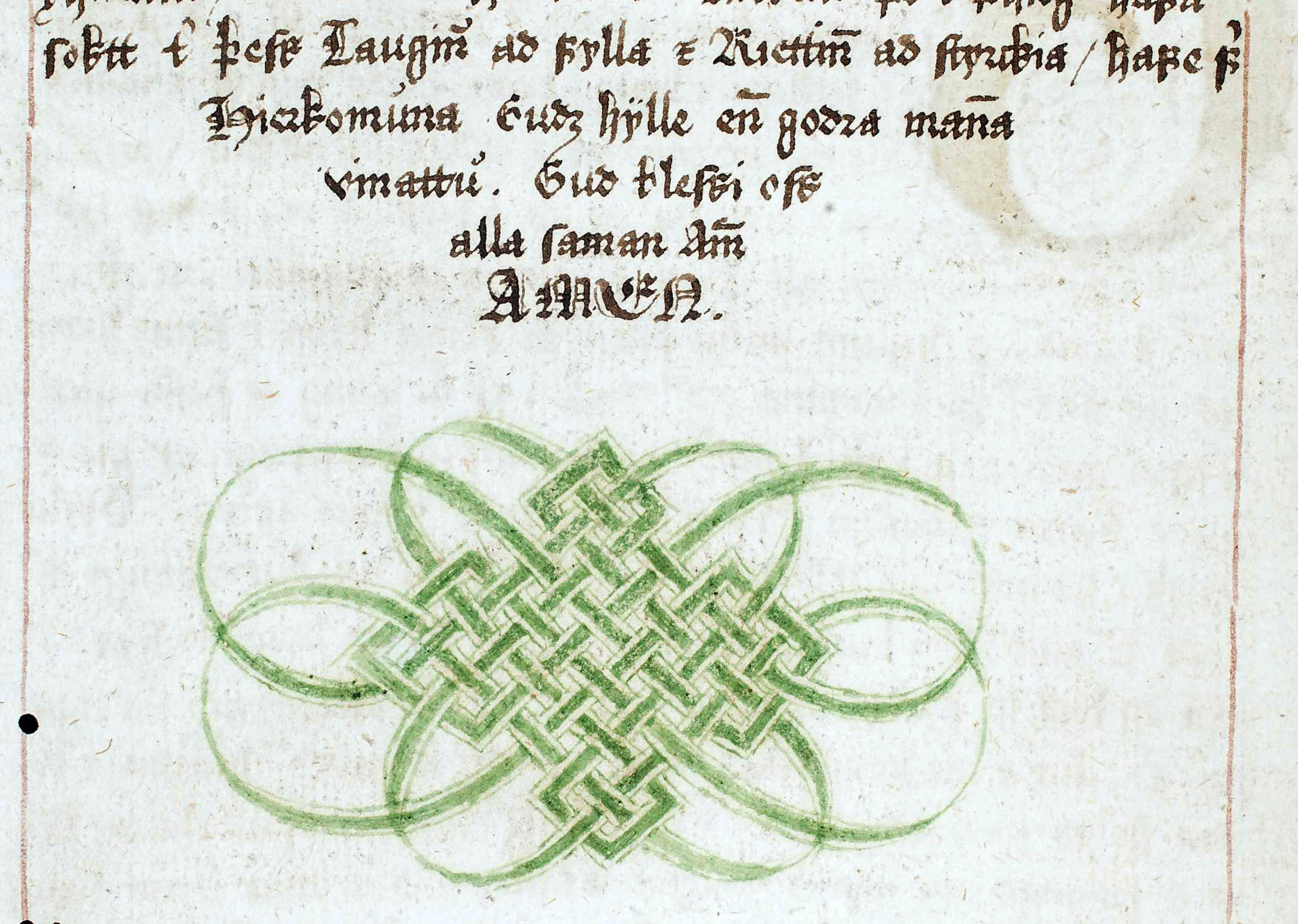
Vignette | Small ornamental element at the end of a text, as often found in
early modern manuscripts. They often co-occur with half-diamond indention of
the explicit of a text. In the example: A vignette with a geometrical interlaced ornament below the end of a chapter in GKS 3274 a 4to, f. 250v. |
|
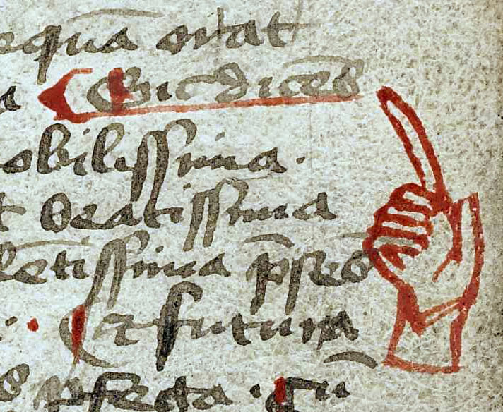
Maniculus (pl. -i) | A small hand in the margin pointing at a word or phrase of the written
text. In the example: A red maniculus in the outer margin of AM 76 8vo, f. 11r, l. 16–22. |
|
Missing illumination | Illumination that has either been laid out, but the allowed space
was never filled, or has later been scraped off or cut out. It will be
registered in the header similarly to missing initials. Instances of
left blank spaces can contain notes for the illuminator that indicate the
planned motif. In the example: The full-page illumination in AM 132 4to, f. 1r was scraped off at a later point leaving a brighter area. The outlines of the former illumination can still be perceived, it showed a seated king with a haloed crown and in his hands an orb, an axe and a cross-staff; probably St. Olaf. |
Table 2. Ill. 7.17–7.29 showing the most common types of illumination (other than initials).
Examples applying these terms are given in the following section dealing with motifs. Please note that the occurrence of minor but highly frequent illumination types (e.g. line fillers and maniculi) can be summarized at the end of the list, similar to minor initials (see ch. 7.2.1.1). Furthermore, it is of interest to register missing illuminations as they document conditions of manuscript production (e.g. planned, but not executed elements), intended text structure or re-use (e.g. removed at a later point in time).
7.2.2.2 Motifs
The motifs and composition of the various illuminations is normally listed using basic key words. As for the decoration of initials, a longer and more detailed description that would obscure the readability if provided in the beginning, may be given later in the same <decoNote> (see ch. 7.2.7).
Representational motifs include both objects as well as animate beings, such as humans, animals or hybrid creatures. To register these, one simply identifies what one sees (as best as possible) and briefly names the depicted objects, beings and scenes. The description is given in free text, possibly supplemented by a distinctive attribute, e.g. “sword”, “hanged thief”, “dog”, “bearded face”, “gryllus”. In case of a narrative scene a verbal phrase may be used, e.g. “man hitting mermaid with a sword”, “judges leading thief to the gallows”. Terms for some rather specific, but frequent motifs are explained in the following overview.
| Example | Motif | Explanation | |
|---|---|---|---|
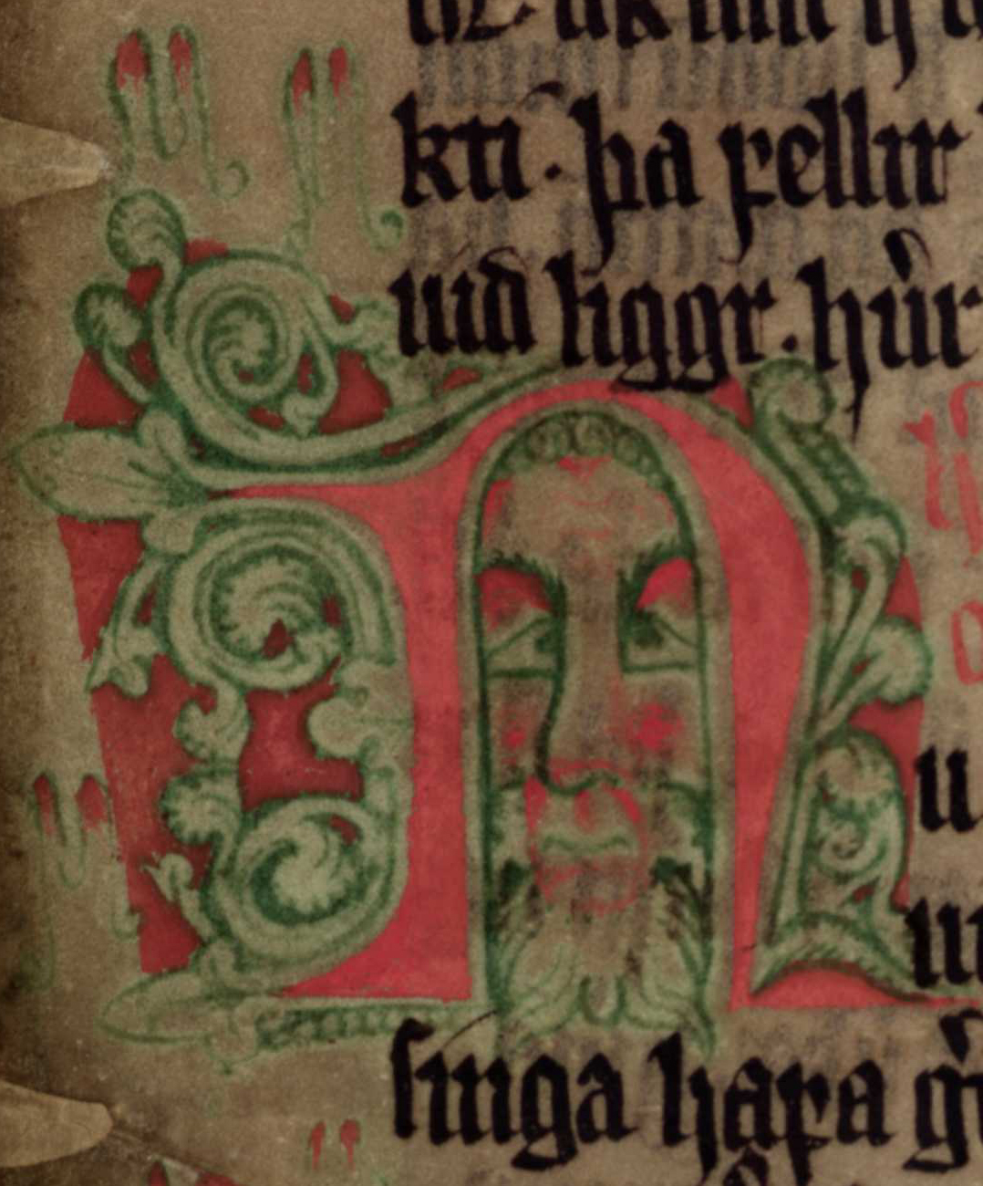
|
Bearded face | The counter of an initial is filled with a drawing of a
(bearded) face. Common in chapter initials. In the example: A bearded face found in the counter of the initial “n” in AM 350 fol., f. 15ra, l. 12–15. |
|
|
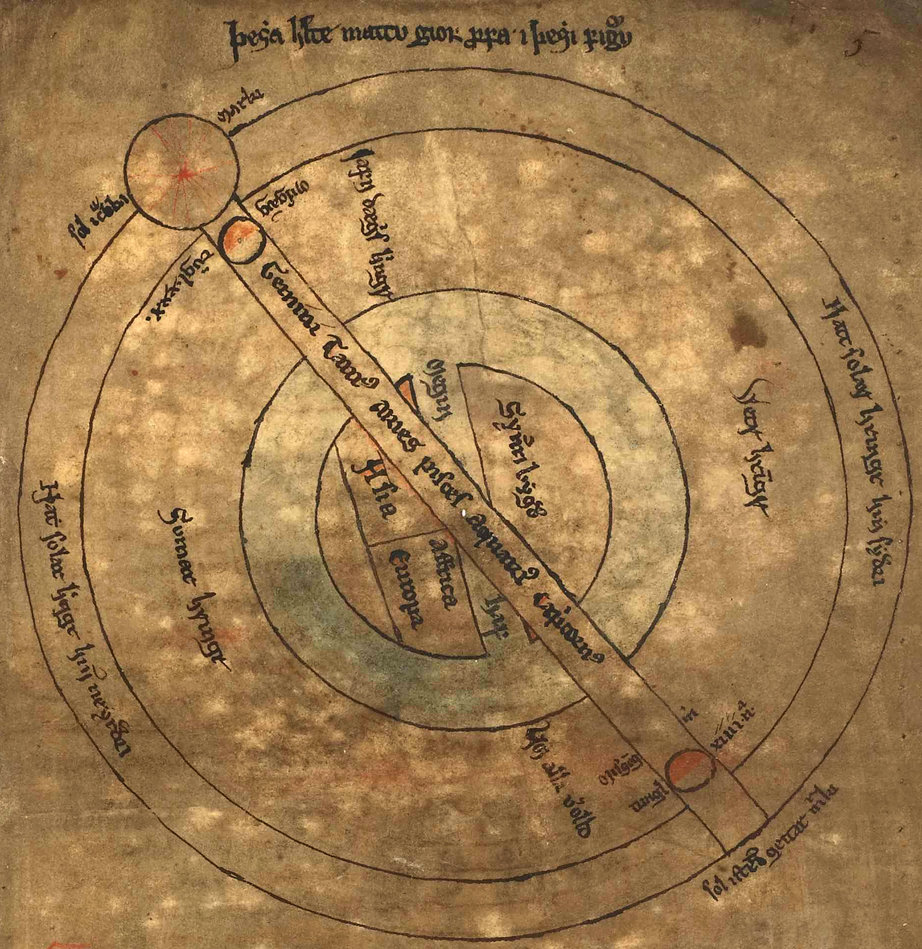
Diagram | Two-dimensional schematic representation combining script and usually
rather geometrical forms as lines and circles. Please indicate the
represented content. In the example: Diagram showing the position of the earth, sun and moon in AM 732 b 4to, f. 3r, below l. 1. |
|
|
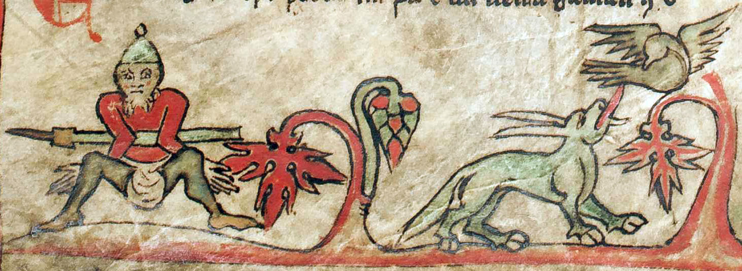
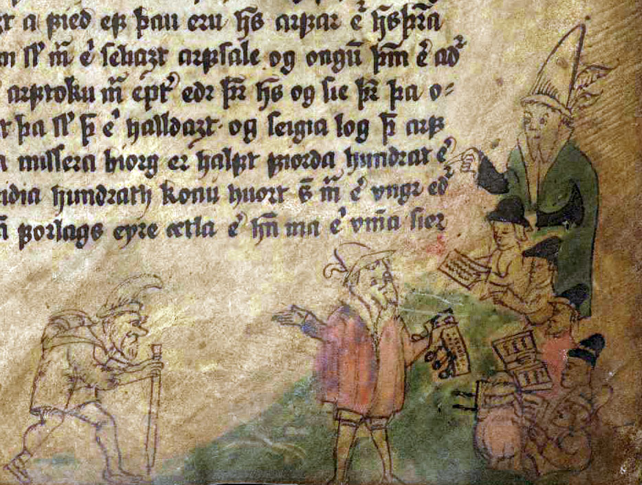
Drollery | Playful and funny motifs in general, e.g. a fox hunting a rabbit,
grylli or a knight fighting a snail. In the example: A drollery scene with a man with a helmet and twisted arms as well as a cloven-hoofed canine chasing a bird in the bas-de-page of GKS 1005 fol., Flateyjarbók, f. 5v, bottom margin. |
|
|
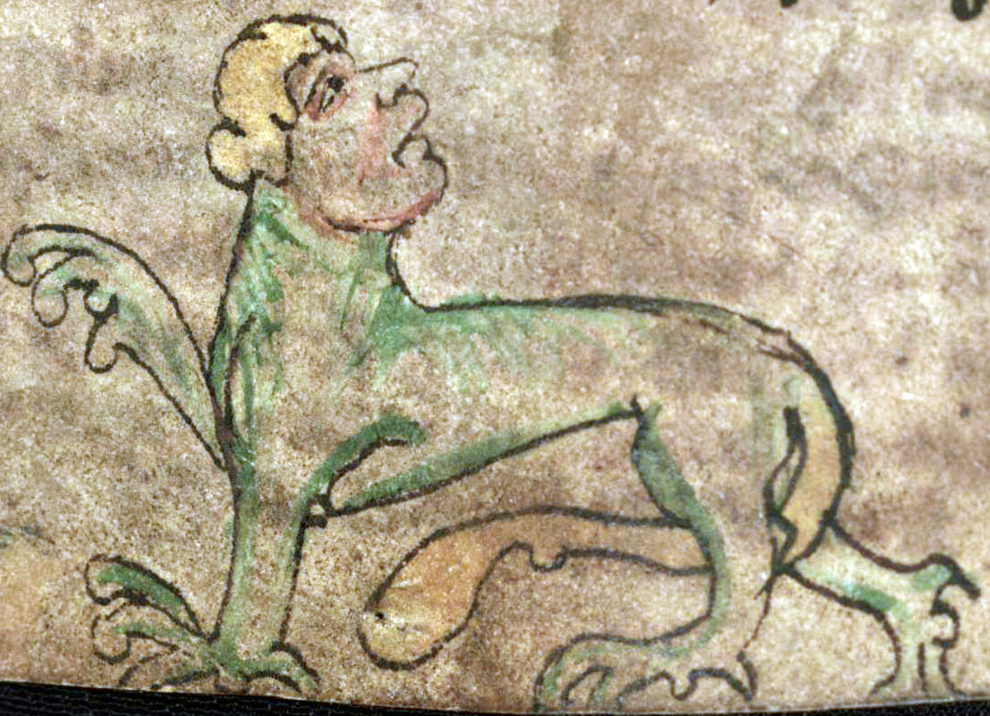
Grotesque | A hybrid fantasy creature of usually human and animal components. In the example: A quadruped grotesque with a human head and a long tail in AM 147 4to, Heynesbók, f. 23v, bottom margin. |
|
|
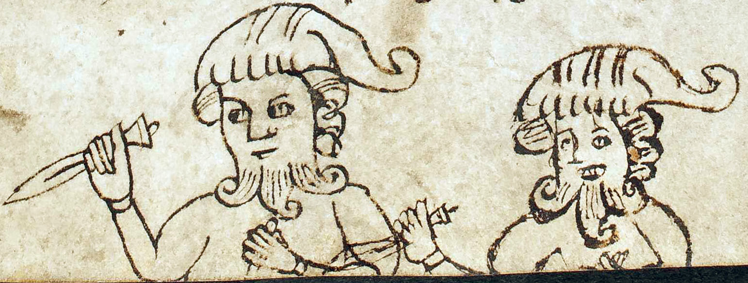
Gryllus (pl. -i) | Playful grotesque creature usually broad-bottomed with two animal rear
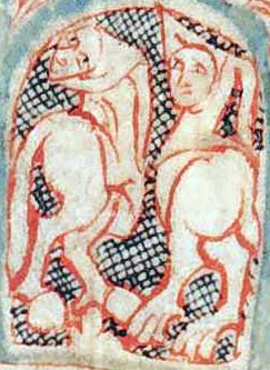
legs and a human face; often with a tail and wearing a gugel. In the example: Two hooded grylli in the counter of an initial of GKS 1005 fol., Flateyjarbók, f. 6vb, l. 46–50. |
|
|
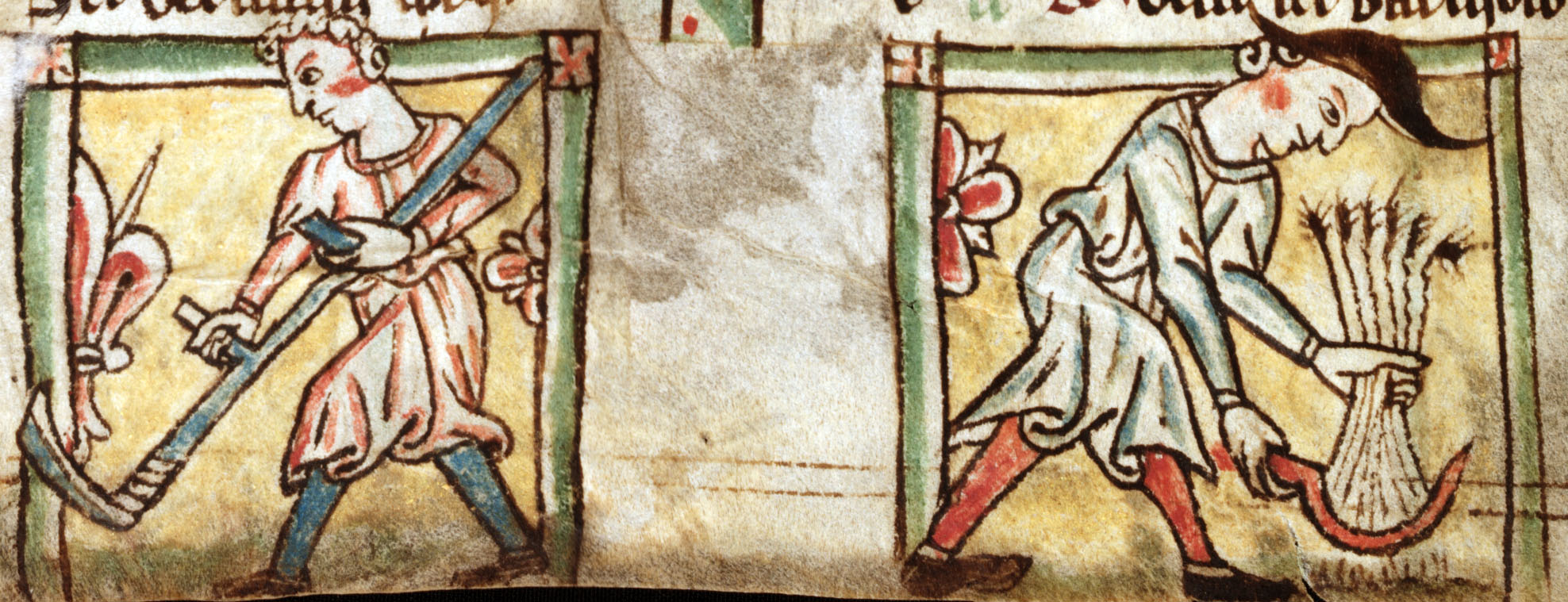
Labours of the month | Images of agricultural activities connected to the individual
months, usually in connection with calenders. In the example: Haymaking with a scythe in July and harvesting the crops with a sickle in August from a calender in Lund, Medeltidshandskrift 15, f. 140v, bottom margin. |
|
|
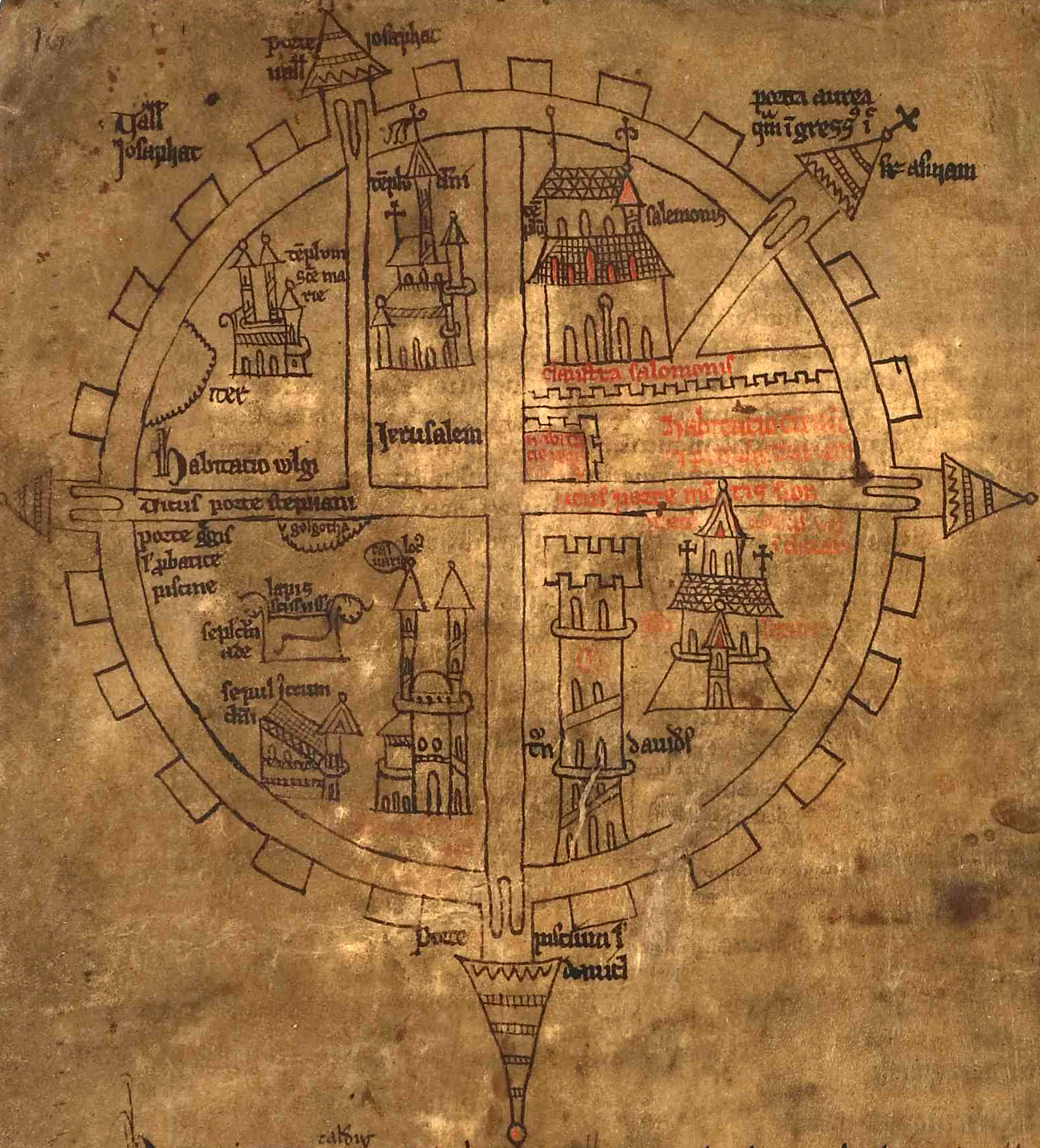
Maps | A two-dimensional representation of real or imagined places often
with captions. Please indicate the represented place(s). In the example: A map of Jerusalem in AM 732 b 4to, f. 8v, upper half of the page. |
|
|
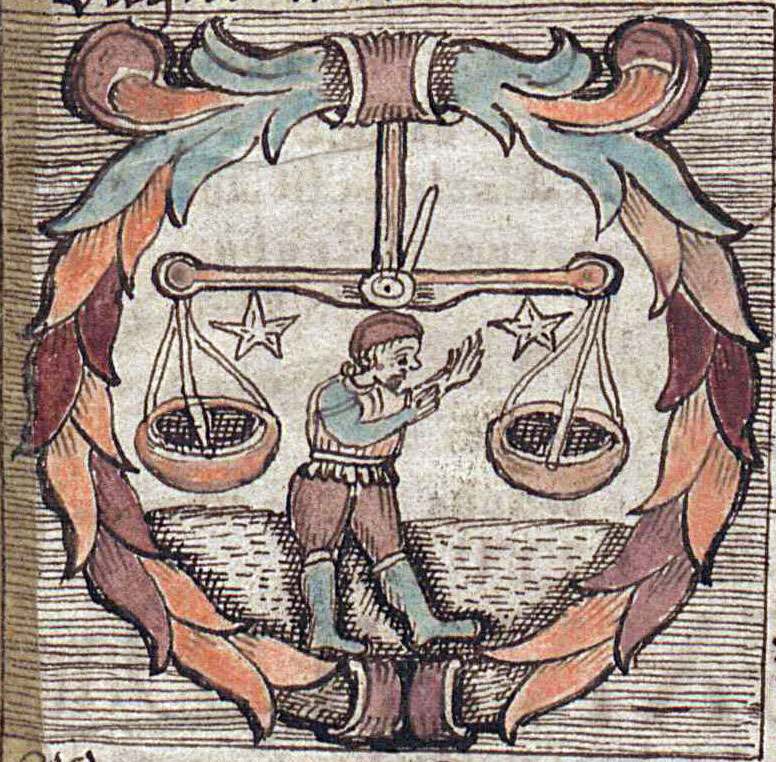
Zodiac signs | Depictions of the 12 zodiac signs. Please indicate the represented sign, i.e. Aries, Taurus, Gemini, Cancer, Leo, Virgo, Libra, Scorpio, Sagittarius, Capricorn, Aquarius or Pisces. In the example: A miniature showing the Libra of the zodiac signs in Lbs 781 4to, f. 46r, upper left corner. |
Table 3. Ill. 7.30–7.37 showing common motifs found in illuminations.
The very first XML example given in ch. 7.2 above already includes a brief description of the motif(s). Such descriptions should be included in the prose description of a <decoNote> when applicable, and they have their natural place right after the location and illumination type:
<decoNote>
  <p>F. <locus from="7r" to="7r">7r</locus>:
    bas-de-page, two dogs running, a lamb and a bird.
    Colours: black, dark red, white.</p>
</decoNote>
In case of abstract motifs such as ornaments, the form and type(s) as well as potentially involved motifs are described as best as possible.
7.2.3 Use of colours
It is relevant to note the usage of different shades of ink and colours and (their distribution) in both initials and other illuminations. Among others, this helps understanding the indented structure of a text from the hierarchy of the initials and other illuminations. This is particularly relevant for readers who do not have access to either the manuscript or colour photographs thereof. In the optimal case the colours and their hues are listed separately for each <decoNote>. However, the colours may also be usefully be given in a summary, e.g. in the case of alternating use of colours as occurs frequently with initials. It would be desirable to be as accurate as possible with regards to naming the colours with reference to the pigments and inks used (e.g. white lead, massicot, orpiment, yellow ochre, burnt sienna, minium, vermillion, madder, crimson, burnt umber, azurite, cobalt blue, ultramarine, woad, malachite, verdigris, raw umber etc.). Nonetheless, such identification is often not possible from the available images or without scientific analysis. Therefore, if it is not possible to determine the pigments used, we encourage encoders not to hesitate to use simple descriptions such as “light blue” or “brown red”. If applicable, the colour hue of the outline of the illumination can be listed separately in the end prefixed by “Outline: ”.
For example, the below description of the illumination in AM 345 fol. on f. 1v lists information on the colours and ink following the basic description of the motif (and the caption). After that mention is made of the outline’s hue:
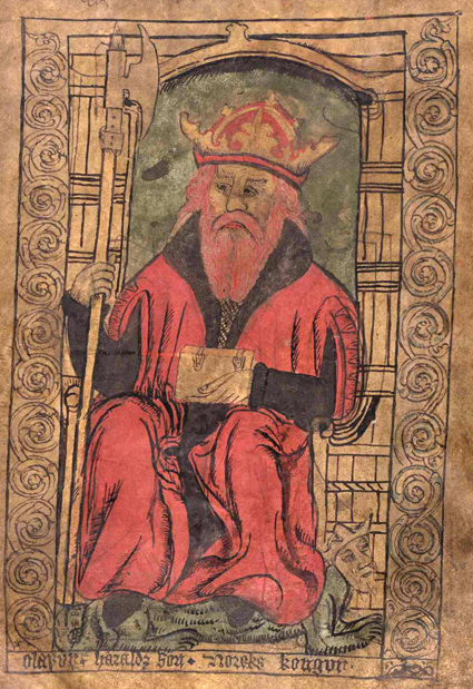
Ill. 7.38. AM 345 fol., f. 1v.
<decoNote>
  <p>F. <locus from="1v" to="1v">1v</locus>:
    full-page illumination, Holy King <name type="person">Óláfr</name>.
    Caption: <q>Olafur · Haraldz son · Noreks kongur</q>.
    Colours: yellow, dark green, light red, black.
    Outline: black, brown.</p>
</decoNote>
Note: The colours of initials are also described as part of the encoding in the transcription (see ch. 7.3.4). There, however, colours found in individual initials are only encoded in a simple manner. Consequently, we recommend to include the detailed – and potentially more specialized – description in the manuscript description, i.e. as part of the header, instead.
7.2.4 Captions
Illuminations, including initials, can contain captions. If present, the text of captions should be transcribed separately. Like other transcriptions from the manuscript, transcriptions of caption are treated as quotes in the header and, thus, they are wrapped in <q>-elements. The example below shows how the caption found in the illumination on f. 1r of AM 345 fol. may be transcribed.
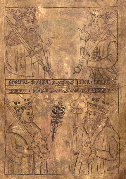
Ill. 7.39. AM 345 fol., f. 1r.
<decoDesc>
  <decoNote>
    <p>F. <locus from="1r" to="1r">1r</locus>: full-page illumination,
      four kings (<name type="person">Sverrir</name>,
      <name type="person">Hákon</name>,
      <name type="person">Magnús</name>,
      <name type="person">Eiríkr</name>).
      Caption: <q>Suerrer · kongur ~ Hakon kongur | Magnus · kongur
      ~ Eirikur · kongur</q>.
      Colours: black, brown (outline).
    </p>
  </decoNote>
 </decoDesc>
7.2.5 Hands and dating (if known)
In case the hand(s) and/or the dating of illuminations differ from the hand(s) or dating of the adjacent main text, this information should be included if available. A mention can either be made in a general statement for all illuminations or given separately in the individual <decoNote> elements in question. As in other places where information about involved people or dates occurs in free text, these are marked-up using the elements <name> and <date>, respectively, with the appropriate attributes @type and @when or @notBefore/ @notAfter . The encoded information could look like this:
<decoNote>
  <p>Ff. <locus from="1r" to="27v">1r-27v</locus>:
    penwork sentence initials, 1 l., added later (potentially
    by <name type="person">Jón Jónsson</name>).
    Colour: black.</p>
</decoNote>
7.2.6 Illumination techniques (optional)
We consider the description of illumination techniques optional, but encourage their inclusion if possible. In most cases it should not take too much effort to identify the technique and if the same technique was used consistently throughout the manuscript it can be summarized. It will give – similar to the mention of the used colour hues – a much better impression of the decoration to a reader without access to the manuscript or images thereof. If the techniques vary from illumination to illumination this fact should be indicated and described in the prose of the separate <decoNote> elements.
Some more common illumination techniques include:
| Example | Illumination technique | Explanation |
|---|---|---|
|
Gold leaf | Thin layers of gold foil applied onto the page that can be further
decorated, i.e. by burnishing, tooling or painting/sgraffito. In the example: The body of the initial “n” is decorated with gold leaf and fully painted ornamentation in AM 322 fol., f. 53rb, l. 21-28. The gold leaf is partly peeling off today and reveals the underlying grounding. |
|
Gold substitute | Metallic glimmer used as cheaper alternative to gold leaf, sometimes based on tin
or silver. These glimmer particles were often soluted in binding agent and
applied onto the surface with a paintbrush, frequently leaving the ground
or outlines visible. Please note: The usage of yellow colour instead of gold is not meant here. In the example: Liquid gold substitute applied onto the drawings, leaving the outlines of the halos visible in AM 421 12mo, Marine Jesperdatter’s prayer book, f. 71v. Please note: In other instances in this manuscript, the substitute can appear rather silver or even oxidised grey. |
|
Fully painted | Opaque colours, often blend colour hues, applied in several layers. In the example: The initial “B” and botanical ornaments fully painted; light ornaments were applied on dark ground colours in AM 442 12mo, f. 4v, l. 17–23. |
|
Colour wash | Transparent colours usually leaving the outline drawing underneath
visible. In the example: Red and green colour wash applied onto some parts of an outline drawing, in AM 345 fol., Reykjabók of Jónsbók, f. 27r, bottom margin. |
|
Outline drawing | Lines drawn with an (ink) pen (can be colour washed). In the example: Outline drawing using pen and ink in AM 132 4to, f. 12r, bottom margin. |
|
Pasted | Illuminations pasted into the manuscript, sometimes from sources other
than manuscripts, e.g. printed books. In the example: Outline drawing using a pencil on tracing paper that was pasted onto the preexisting leaf in JS 133 4to, f. 37v. |
|
Reuse in palimpsest manuscript | The original script was scraped away but the
illuminations were left untouched to be integrated into the new text. In the example: The Old French translation in the right column was scraped off and replaced by an Old Icelandic translation keeping and that way re-using the initial “Q” in AM 618 4to, f. 37rb, l. 21–26. |
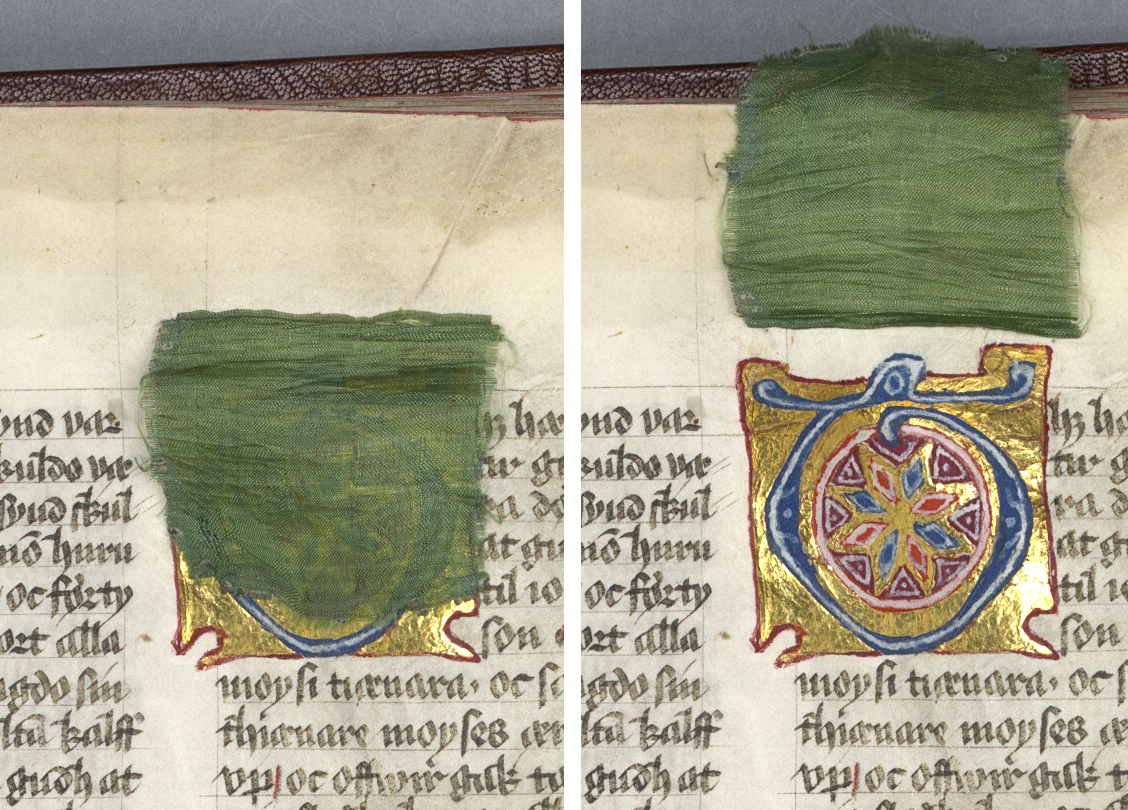
|
Curtain | A small piece of cloth is glued or sewn onto a leaf with the purpose of protecting an illumination from abrasion. In the example: A small green curtain is sewn onto the parchment to protect a delicate initial that is fully painted and decorated with gold leaf. The curtain can be turned up to reveal the initial “T” in Stockholm, A 1, f. 148rb, l. 1–9. |
Table 4. Ill. 7.40–7.47 showing common illumination techniques.
7.2.7 Advanced description of motifs and composition (optional)
When describing motifs one may want to provide more detail than one-word descriptions can cover. In particular, the description of motifs can be improved by accounting for the composition of the illumination and/or connecting them to the different parts of the initial, such as the counter or the termination (see also the glossary provided at the end of this chapter, ch. 7.4). We recommend to always provide basic information at the beginning of each <decoNote>, potentially followed by more specialized details at the end as shown in the following example:
<decoNote>
  <p>F. <locus from="4v" to="4v">4va:28-30</locus>:
     pen-flourished inhabited chapter initial A, 3 l.
    Colours: light red (body of the letter), dark blue (pen flourish).
    The counter of the initial is inhabited by a two-legged creature
    in front of a blue grid. The creature was drawn in the same dark
    blue colour as the pen flourish of the initial.</p>
</decoNote>
With regards to Christian iconography, it is desirable to identify the most common motifs. While it would be sufficient to give a general identification, such as “Christ on the cross” or “female Saint”, more specific descriptions are highly welcome and will increase their value for other researchers. For help identifying Christian iconography we recommend the Iconclass Browser http://www.iconclass.org/help/outline, a tool developed for identification of iconography of art with a special focus on Christian iconography. For example, if you are in doubt about what is depicted in an illumination and the text does not give any clue, you can conduct a combined search in the Iconclass Browser searching for the elements you can identify. A search for “female saint AND wheel”, for instance, will tell you that, according to iconographic tradition, a wheel identifies either St. Catherine or St. Christina. Furthermore, the search results will guide you to identify the female saint as one or the other, depending on other details of the depiction.
For an exemplary and very detailed manuscript description with regards to the iconography and composition of illuminations see the entry for AM 226 fol. in the online catalogue on the handrit.is website: https://handrit.is/en/manuscript/view/da/AM02-226. (Please note, however, that the details of the XML encoding guidelines for handrit.org differ slightly from the practices recommended here.)
Finally, in the advanced description part of illuminations it is possible to include more specific art-historical aspects, such as the classification of the illumination style, e.g. Gothic, Insular, Romanesque or Renaissance.
7.3 Encoding initials in the transcription
This section describes how to encode initials, including sentence initials (also called littera notabilior), as part of the transcription. The decoration of initial letters can vary considerably, but the degree of decoration (motifs/ornaments and uses of colours) is usually connected to their function. Thus, a manuscript may have quite large and splendid main initials while at the same time displaying more modest decoration for initials introducing subordinate sections such as paragraphs or sentences. This information is worth to be marked-up in the transcription, so that it can be directly linked to the corresponding text.
In the transcription, the mark-up of initials and other emphasized letters is rather standardized and confined to a couple of basic categories. We recommend to use the element <c>, which can take several attributes (see further below). The more detailed description of initials (usually in prose) should be given in the document header as described above (see ch. 7.2).
Since the specific characteristics of initials are visual, the special mark-up of such letters is usually restricted to the facsimile level of the transcription. This is at least the case when a transcription is conducted on multiple levels. When initials are marked-up on the facsimile level, that information is not repeated on the diplomatic or normalized level. Instead, initials are simply transcribed like any other letter on those levels. If a transcriber, however, chooses not to transcribe a text on the facsimile level, but still wishes to include information on initials, the mark-up may be used on the diplomatic level (or on the only present level in case of a single-level transcription). Simple mark-up of an initial in a three-level transcription looks like this:
<w>
  <choice>
    <me:facs><c type="initial" subtype="opening">h</c>ier</me:facs>
    <me:dipl>hier</me:dipl>
    <me:norm>Hér</me:norm>
 </choice>
</w>
Please note: Besides defining some of the most relevant characteristics of the initials and providing that information in a consistent and thus highly valuable manner for analysis, the initial mark-up in the transcription can be read by appropriate stylesheets that transform the XML transcription for display. However, the display options of XSLT stylesheets may differ, and at the current point of the technical development (that is easily accessible), the display of initials in the Menota-stylesheet is confined to a rather basic approximation.
7.3.1 The letter and its form
An initial (as any other character) is part of the transcribed text. Therefore,
it needs to be written, or rather typed, by the transcriber. In the same way as for other characters,
the letter form may be noted and reproduced on the facsimile level using one of the
Unicode characters. For instance, an insular capital “F” can be encoded with the entity &Fins;
(for more details on characters and encoding rules see ch. 5.2.). The mark-up for further describing
the special characteristics of the initial is then built around the character, since it is understood as a qualification of how the letter
was executed in the manuscript.
If an initial is missing – because it was never filled in, because it has been erased from the manuscript or because it was cut out – the missing letter is encoded in accordance with the general rules for transcription. The same applies to initials that were added later (see ch. 8.3 for the encoding of the <space/> element, and ch. 9 for the encoding of scribal or editorial intervention). The mark-up of the missing or added initial is wrapped in the element <c> as normal. The following example shows how a missing initial “N” is encoded using <space/>. The attribute @quantity is used on <space/> to indicate the number of characters omitted, which is specified by the value ‘chars’ of the attribute @unit.
<w>
  <choice>
    <me:facs><c type="noInitial" subtype="chapt">
      <space quantity="1" unit="chars"/></c>v</me:facs>
    <me:dipl><supplied reason="restoration" resp="BS">N</supplied>v</me:dipl>
    <me:norm><supplied reason="restoration" resp="BS">N</supplied>ú</me:norm>
 </choice>
</w>
7.3.2 Hierarchy of initials
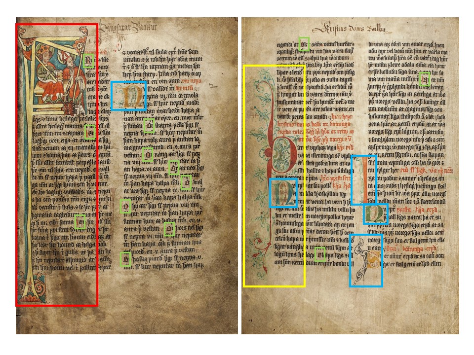
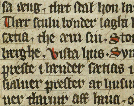
Ill. 7.48. Hierarchy of initials exemplified in AM 351 fol., f. 2r and 72v. Red: historiated opening initial, 8 l. Yellow: pen-flourished chapter initial, 5 l. Blue: pen-flourished paragraph initials (note that the “I” is not indented), 2-3 l. Green: colour-stroked sentence initials (littera notabilior).
In most manuscripts, structurally different types of initials and highlighted characters occur. Usually, the various types are distributed in a systematic hierarchical way and can be identified based on their size, their decoration, their location on the page and their position regarding the text’s overall structure. Going beyond the rough dichotomy between major and minor initials, it is common to distinguish between opening initials, text initials, chapter initials, paragraph initials and sentence initials.
The attribute @type (with the value ‘initital’) is used to distinguish the character from other characters that are marked-up by means of the <c>-element, such as hyphens (see ch. 5.5). The more specific attribute @subtype will then indicate the type of the initial, e.g. whether it is a text initial or a sentence initial. If it is not possible to distinguish between more than major and minor initials, however, these two main subtypes may also be used. Possible values for @subtype when used for initials are thus: ‘opening’, ‘text’, ‘para’ and ‘littNot’ (for littera notabilior or sentence initial) as well as ‘major’ and ‘minor’. Please note that some manuscripts do not display any hierarchy in the way the initials are presented (for instance when all initials are of the same size and have the same (simple) degree of ornamentation). In those cases, as well as in cases when the initial subtype has not been defined, the attribute @subtype is omitted.
The mark-up of initial subtypes is supposed to represent the hierarchical division indicated in the manuscript by means of the initials’ size and their degree of decoration. This categorization is thought to summarize the results of the encoder’s analysis considering the overall distribution and presentation of initials in a given manuscript that are specified in more detail in the attributes @style and @rend (see sections ch. 7.3.3 to ch. 7.3.5) . The hierarchical division indicated by the size and artistic features of initials may therefore divert from the traditionally perceived structure of a text, such as chapter divisions in standard editions.
If an initial is omitted or missing, this is indicated by the attribute @type with the value ‘noInitial’. Even though this might seem somewhat redundant if other mark-up such as <space/> or <gap/> is present, it has the advantage that, for instance the subtype and the intended size of the missing initial may be encoded and thus searched for.
| type | subtype | Defines the subtype of c, if type="initial" |
|---|---|---|
| initial | ‘opening’ | An opening initial: The first, often largest initial of a manuscript. |
| initial | ‘text’ | A large initial at the beginning of a new text (if applicable). |
| initial | ‘chapt’ | An initial at the beginning of a new chapter or major section or a text. |
| initial | ‘para’ | An initial at the beginning of a paragraph or subunit of a text (if applicable). |
| initial | ‘littNot’ | The character is a sentence initial (littera notabilior): The first letter of a sentence is highlighted within the line by means of colour-stroking (i.e. coloured filling of the counters of the letter or a usually red stroke), has minor decoration or is written in slightly enlarged display script. |
| initial | ‘major’ | A major initial (without any further qualification). |
| initial | ‘minor’ | A minor initial (without any further qualification). |
| noInitial | ‘opening’ | The opening initial is omitted or missing. |
| noInitial | ‘text’ | A text initial is omitted or missing. |
| noInitial | ‘chapt’ | A chapter initial is omitted or missing. |
| noInitial | ‘para’ | A paragraph initial is omitted or missing. |
| noInitial | ‘major’ | A major initial is omitted or missing. |
| noInitial | ‘minor’ | A minor initial is omitted or missing. |
Let us have a look at some examples:
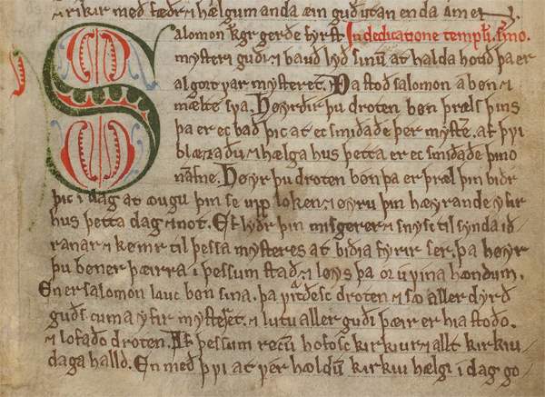
Ill. 7.49. Puzzle chapter initial “S” (l. 16-22) and several sentence initials, for instance in the word Ða in the middle of l. 18 in AM 619 4to, f. 47r, l. 15–29.
In the transcription, initials are encoded in their logical place within the text. In a single-level transcription, the chapter initial "S" in the first word of line 16 (second line in the picture above) is, therefore, encoded as follows with regards to the type and subtype:
<w>
  <c type="initial" subtype="chapt">S</c>alomon
</w>
In comparison, the sentence initial in the word Ða on line 18 is encoded as:
<w>
  <c type="initial" subtype="littNot">Ð</c>a
</w>
While a rather plain mark-up as shown in the two examples above would be perfectly valid, we highly recommend also to describe the characters’ specific features using additional attributes. We consider it good practice to indicate at least the size (see ch. 7.3.3) and colour(s) (see ch. 7.3.4) in addition to the type and subtype.
7.3.3 Size of initial
The size of the initial is often connected to its type and function. In the transcription we recommend to indicate separately the height of different parts of the initial. All measurements are given in natural numbers corresponding to the writing lines on the same page: 1. The initial height, indicating how many lines have been indented – often corresponding to the x-height or cap height of the letter. In case the initial was laid out but never executed, it should still be possible to determine the intended initial height of the non-existing initial due to the space left blank by the scribe; 2. The ascender and descender heights, giving the number of lines that each ascender and descender (or attached shaft) extend above and below the initial height, respectively (usually in the left margin next to the text). Note: The letters “I/J” and “L” present special cases, which are discussed below.
In XML, we recommend to indicate the size of initials as part of the @style attribute on the element <c>. In order to document both its size and relative position in the written area, the value of the initial height, i.e. the number of indented lines, is marked-up as a combination of two values. These two values denote separately how many lines the initial height extends upwards including the line on which the character has its logical position in the text (i.e. “up”), and how many lines it extends below that line (i.e. “down”).
For example, in the picture below the initial height corresponds to eight writing lines and the character “A” belongs logically on the fourth of these eight lines where it forms part of the word “AT”. In the XML mark-up we therefore indicate that the initial height goes four lines up (i.e. the line that starts with “AT” is indented, and the initial height extends for three more lines above that) and four lines down. The two values together give the total number of indented lines: 4+4 = 8. The initial height of the “A” from the example can thus be marked-up as shown below the image.
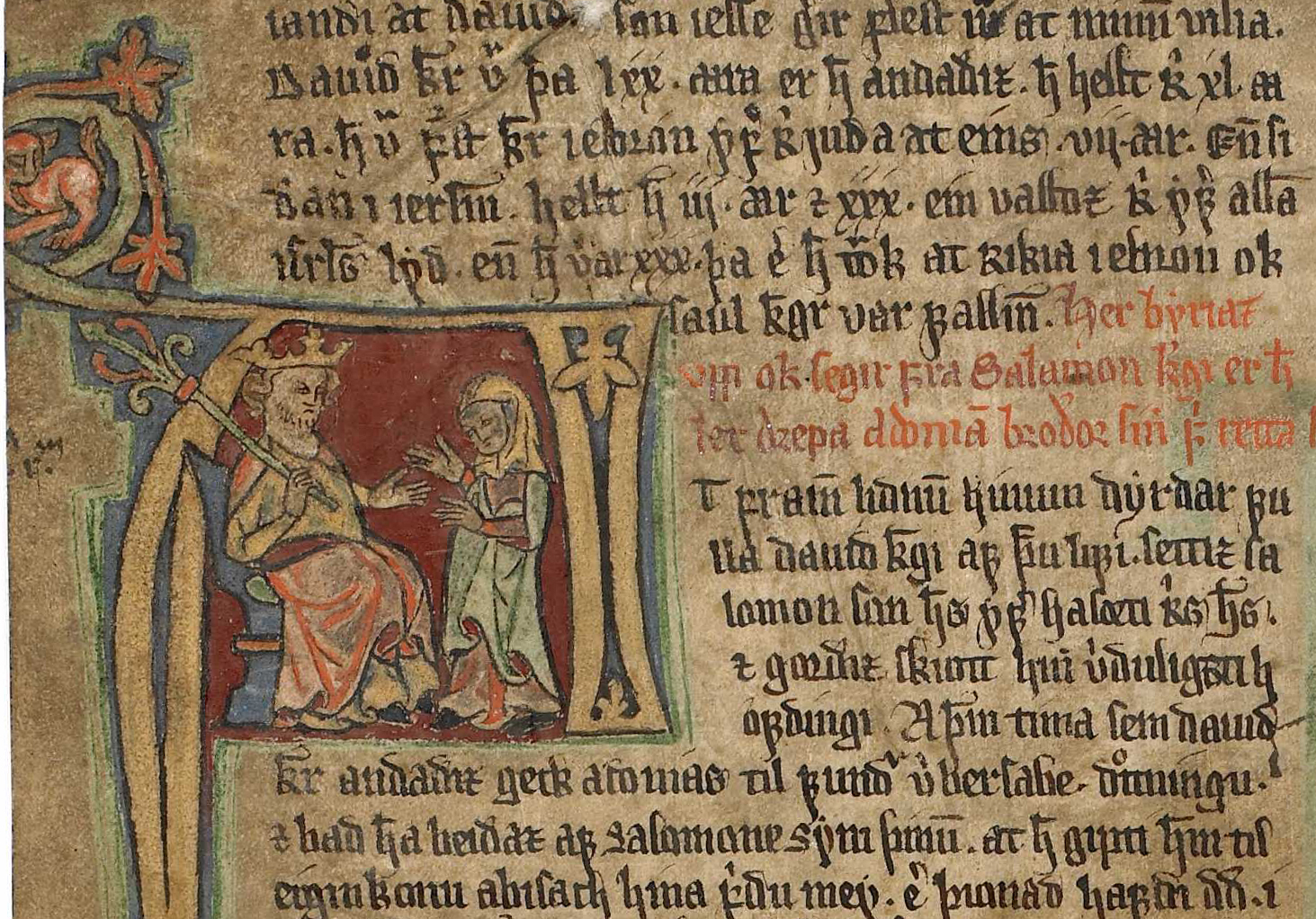
Ill. 7.50. Historiated text initial “A” in the word AT in AM 226 fol., f. 96va, l. 2–17.
<c type="initial" subtype="chapt" style="u4 d4">A</c>The various values of @style are separated by white spaces, and the numbers are preceded by an identifying letter (or letter combination), in this case “u” for up and “d” for down. In the same way, we can indicate the size of the ascender and descender of the initial in the margin, using the preceding letters “mu” (for margin up) to denote the height of the ascender and “md” (for margin down) to denote how far down the descender extends below the initial height. For the initial “A” the complete markup of the size then looks like this (note, however, that the image does not show the entire descender, which extends far down):
<c type="initial" subtype="chapt" style="u3 d4 mu5 md28">A</c>If any of the values are omitted they are assumed to be zero. The size of the initial “S” from ill. 7.49 above can therefore be encoded as:
<c type="initial" subtype="chapt" style="u1 d6 md2">S</c>Note that the value of @style is given as “u1 d6 md2”, indicating that the initial height merely goes up one line (the line of the initial’s logical position) and six lines down from there. The initial also extends below the indented initial height by two lines, which is denoted with “md2”. Since no value is given for “mu”, it is assumed to be “mu0”. This is correct, because there is no ascender exceeding above the initial height.
Sometimes the adjacent lines to initials, especially with“I/J”, are not indented even if the lines for other initials in the manuscript that belong to the same hierarchical level are indented. This is often due to the letter’s shape that lends itself particularly well to being in the margin only. According to its degree of decoration (and potentially how far the initial stretches out into the margins) it is nevertheless normally possible to identify the correct initial type. In other words, the number of indented lines (the initial height) is not crucial for the functional analysis of these letters. In the XML-markup of an initial “I/J”, which does not have an indented initial height, the values for “u” and “d” are simply omitted, since they equal zero. The values for “mu” and “MD” are counted relative to the line, onto which the initial logically belongs, and “mu” also counts the line of the initial’s logical placement. For instance, a text initial “I” that is not indented in the written area, but extends 8 lines into the margin (3 lines up from its logical place and 5 lines down), would be encoded as follows:
<c type="initial" subtype="text" style="mu3 md5">I</c>The initial letter “L” is equally sometimes found with fewer indented lines than other letters of the same level of hierarchy. Other than for “I/J”, however, it is common that “L” is formed with an initial height of one (or tow) indented line(s) for the horizontal bar of the letter. The values for “u” is thus often 1 (or sometimes 2), and the value for “mu” equals the number of lines the initials extents above the indented line(s) as normal.
When (minor) initials are executed as versals they are entirely out-dented into the margin and, thus, do not have any indented initial height either. The values for “u” and “d” are accordingly omitted as they equal zero. Instead, only “mu” and “md” are encoded (in the same way as for initials that are not indented due to their letter form). Again, the size is denoted relative to the logical placement of the initial in the text counting lines up and down from the line onto which the initial belongs.
In case of a missing initial, the number of indented lines, i.e. the initial height (if present), is encoded in the same way as for existing initials. Since it is usually impossible to know if the initial was supposed to extend into to margins or how far, no indication is made for “mu” and “md”, even if a missing initial was supposed to be “I/J” or a versal. The mark-up of a planned, but not executed chapter initial for which a total of four lines are indented (three lines upwards and one downwards), would thus be:
<c type="noInitial" subtype="chapt" style="u3 d1">
   <space quantity="1" unit="chars"/></c>
7.3.4 Colour(s)
It is relevant to note the colour(s) of initials and other highlighted characters. If initials are monochrome, i.e. only a single colour or hue is used, one might be interested in if and how the colours alternate with other initials; and in the case of multiple colours or hues, the number and distribution of these may be important with regards to the structural layout of the text.
We recommend encoding the colour(s) of initials by adding yet another value to the attribute @style. The value shall be preceded by “c” for colour and can be used to describe both monochrome and polychrome initials. In case of a monochrome letter, either the simple name of that colour/hue or the more precise six-digit hexadecimal CSS colour code (preceded by #) is given. (For standard CSS colours codes and names see e.g. https://www.w3schools.com/cssref/css_colors.asp.) A monochrome red initial would thus take the value “cRed” or “c#FF0000”. If a letter is bichrome, i.e. uses two colours, both colours are given (again either by name or hexadecimal colour code) and separated by an underscore. If an initial is truly polychrome, i.e. uses three or more different colours or hues, these are equally listed using underscores. The order in which the colours of bi- and polychrome initials are named should follow the order of importance. In other words, the only (or main) colour/hue of the actual initial, i.e. the body of the letter, is mentioned first, followed by a potential second colour of the actual initial or otherwise the main colour of the ornamentation or decoration.
Expanding on the description of the initial “S” from above (ill. 7.49), its encoding with simple references to the colours used looks like this:
<c type="initial" subtype="chapt"
  style="d6 md2 cGreen_Red_Blue">S</c>
If a clear hierarchy of colours is impossible to establish, for instance if a bichrome initial is drawn with two colours that are used on equal terms, that relationship can be encoded by means of using an equals sign instead of an underscore in between the two colours. However, we recommend limiting the analysis of colours in the context of <c> to a general level. More specific and sophisticated descriptions of initials and the colours used should instead be placed in the manuscript description part of the header (i.e. <decoDesc> inside <msDesc>, see ch. 7.2.1 above and further ch. 14.3.3).
If the encoder should be unable to determine the colour(s) employed for executing initials, for instance because they are working from black-and-white images, the indication of color is simply omitted in the transcription.
7.3.5 Artistic rendition
The attribute @rend is used to encode the form and kind of decoration found in or around the initial. This attribute provides a general description of the initial’s artistic rendition without going into too much detail, i.e. by means of keywords only (see the list below). In basic terms the information given here should agree with the description in the header, where a more detailed prose description of the initial’s form and its ornamentation can be included (see ch. 7.2.1.2 as well as ch. 7.2.7).
The attribute @rend is used for indicating both the way in which an initial is drawn and the main means of decoration/ornamentation. Even the presence of guide letters can be indicated here. In order to encompass all of that information, the attribute can take several values (in no specific order) that are simply separated by white spaces. However, things should be kept to a minimum.
| Rend | Indicates the rendition and/or composition of the character (usually initial); more than one value may be combined. |
|---|---|
| ‘historiated’ | Historiated initial |
| ‘foliate’ | foliate initial |
| ‘penFlourish’ | Pen-flourished initial |
| ‘penwork’ | Penwork initial |
| ‘interlaced’ | Interlaced initial |
| ‘puzzle’ | Puzzle initial |
| ‘zoomorphic’ | Zoomorphic initial |
| ‘dragon’ | Dragon initial |
| ‘inhabited’ | Inhabited initial |
| ‘lombard’ | Lombard |
| ‘versal’ | Versal |
| ‘colourStroked’ | colour-stroked |
| ‘guideLetter’ | Guide letter |
| ‘other’ | [Anything else] |
The encoding of the puzzle chapter initial “S” from the example above (ill. 7.49 above) may thus be further expanded with the attribute @rend taking the value ‘puzzle’:
<c type="initial" subtype="chapt" style="d6 md2 cGreen_Red_Blue"
  rend="puzzle">S</c>
Since multiple different forms and decorations can occur in connection with the same intitial, these values may be combined, using whitespace(s) for separation. For example, the initial “A” from AM 226 fol. (ill. 7.50 above) can be encoded as such:
<c type="initial" subtype="chapt" style="u3 d4 mu5 md28"
  rend="historiated inhabited foliate">A</c>
In case the encoder wishes to additionally distinguish between different degrees of the same type of ornamentation, a numbering system may be used in addition to the proposed values. For example, if one wants to indicate how elaborate the pen flourish is in different initials, these can be referred to as ‘penFlourish-1’ and ‘penFlourish-2’, respectively. Please note, however, that such quantifications are neither standardized nor transferable and thus only apply to observations made for individual manuscripts. We suggest that the encoder explains his or her usage of such distinctions in the <teiHeader> if they are employed.
7.4 Glossary
The following is an alphabetically organized glossary covering the most common terms used for describing initials and other illuminations used in this chapter. Terms related to the anatomy of initials are moreover illustrated in ill. 7.51 below.
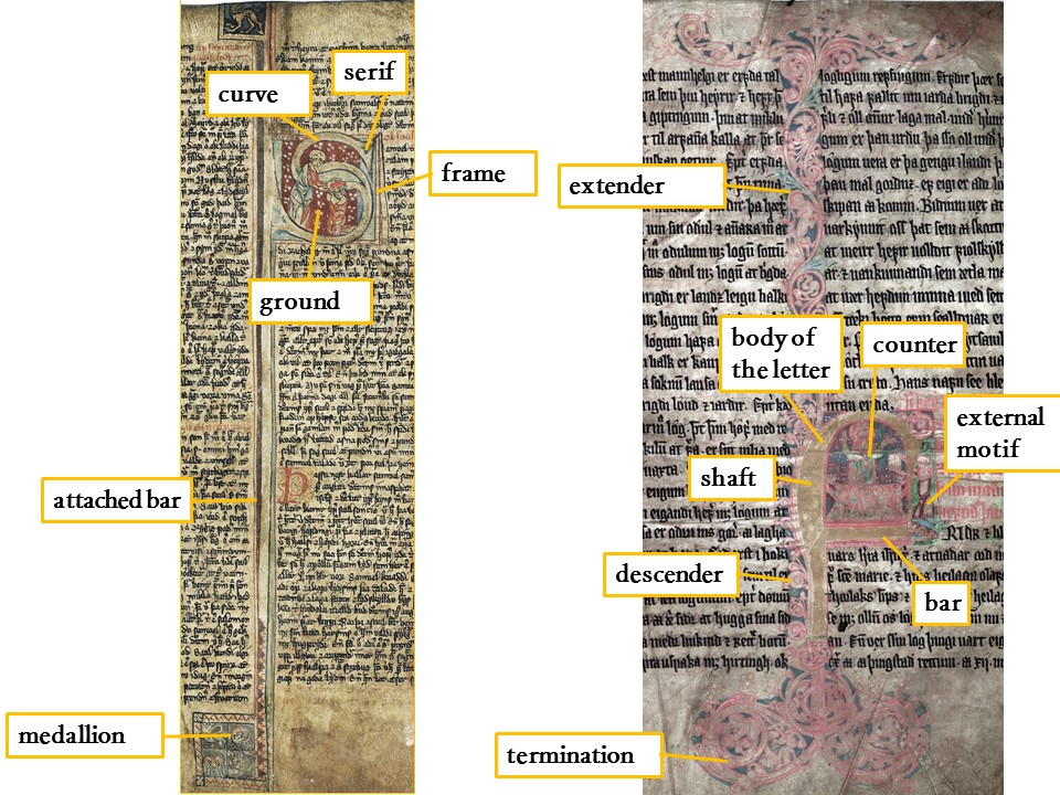
Ill. 7.51. The anatomy of an initial exemplified by AM 225 fol., f. 50v, and AM 350 fol., f. 2r.
| Term | Explanation |
|---|---|
| Ascender | Upper stem of the letter which can be extended for several lines above the initial height until the top of the page. |
| Attached bar | Additional bar attached to the body of the initial elongating the ascenders/descenders. |
| Bar | The short horizontal strokes that are attached to the stem to form letters like “E”. |
| Body of the letter | The strokes that form a letter, consisting of stems, bars, spines, etc. |
| Cap height | Height of the initial including x-height and the ascender which are within the initial height. |
| Chapter initial | An initial at the beginning of a new chapter or section or a text. |
| Counter | Closed space surrounded by the body of the letter as in “o” or open space defined by the body a letter as the two spaces in “S”. |
| Curve | Rounded stroke forming the body of a letter as in the letter "S". |
| Descender | Lower stem of the letter which can be extended for several lines until the bottom of the page. |
| External motif | Ornaments outside the body of the initial (i.e. not within the counters). |
| Extender | Vines attached to initials elongating shafts or attached bars. |
| Frame | Rectangular bars encompassing the decorated background of an initial, similar to a painted picture frame. |
| Ground | The framed area of the initial which has an own decoration or colour and often additionally covers the area just around the letter, usually corresponding to the initial height. |
| Infilling | Decoration of an initial that is placed in the counter(s) of the letter. |
| Initial | Illuminated letter of the manuscript text marking the beginning of a new text, chapter or paragraph. |
| Initial height | Number of text lines that were indented to provide space for an initial at the beginning of the text. |
| Major initial | The most splendid initials of a manuscript, including opening, text and chapter initials. |
| Medallion | Framed rectangular or circular area at the end of initials or as an independent form, which is comprised of motifs or geometric forms. |
| Minor initial | Smaller initials, often more subdued in decoration and appearing more frequently, including subchapter, paragraph and sentence initials. |
| Opening initial | The first, often largest initial of a manuscript (often if there is only one text in the manuscript). |
| Paragraph initial | An initial at the beginning of a paragraph or subunit of a text. |
| Shaft | Vertical strokes that form the body of the letter. They can be elongated and terminate in spirals. |
| Sentence Initial | Slightly highlighted first letter of a sentence; often placed within a line (also called littera notabilior). |
| Serif | Small lateral bar at the end of an initial’s main stroke similar to the fine lines on main strokes in printed serif fonts. |
| Termination | Terminal part of an initial that is decorated with vines, spirals or the like (usually shafts, attached bars or extenders). |
| Text initial | A large initial at the beginning of a new text (if there are several texts in a manuscript). |
| x-height | The height of a letter or a part of a letter in between the base line and the mean line, cf. the size of the letter “x”. |
7.5 Image credits
Most images are taken from the online repository of the respective manuscript’s collection (exceptions mentioned). These are:
Handrit.org for the manuscripts owned by The Arnamagnæan Collection in Copenhagen as well as the National and University Library of Iceland and The Árni Magnússon Institute for Icelandic Studies, both in Reykjavík. Exceptions are the images of the following manuscripts that had not yet been made available on Handrit.org: The Árni Magnússon Institute for Icelandic Studies, Reykjavík, AM 345 fol. (accessed via CD-ROM) and The Arnamagnæan Collection, Copenhagen, AM 421 12mo (accessed via http://haandskrift.ku.dk) and AM 322 fol. (photo by Friederike Richter).
Alvin for the manuscripts owned by Lund University Library.
Manuscripta - A Digital Catalogue of Manuscripts in Sweden for the manuscripts owned by the Royal Library, Stockholm.
E-manuskripter (Det Kgl. Bibliotek) for the manuscripts owned by the Royal Library, Copenhagen.
The diagrams illuminating the hierarchy as well as the anatomy of the initials are by Friederike Richter, based on the images of the aforementioned repositories of the respective collections.